In the ever-evolving realm of branding, a logo stands as the visual cornerstone of your business identity. It’s the silent ambassador that communicates volumes about your brand, making it imperative to tread carefully through the intricate process of design. To guide you on this visual journey, let’s delve into seven common logo design mistakes and explore why avoiding them is crucial for building a strong brand presence.
1. Overcomplication: The Elegance of Simplicity
In the pursuit of uniqueness, the allure of intricate designs can be strong. However, simplicity often holds the key to timeless appeal. A cluttered logo complicates visual messaging and can hinder scalability across various mediums. The challenge lies in distilling your brand essence into a simple yet powerful visual that resonates with your audience.
2. Lack of Versatility: Adapting to Diverse Spaces
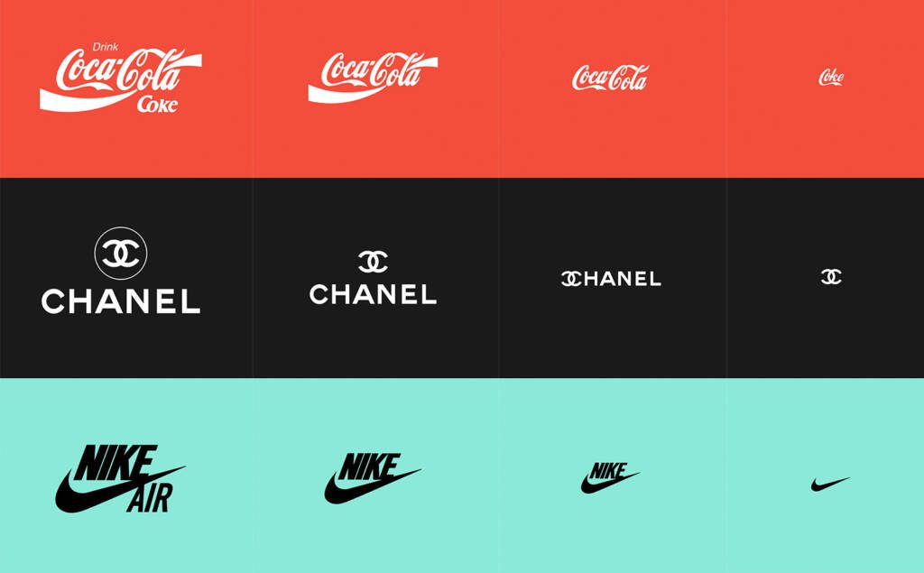
Your logo is not confined to a single space; it should seamlessly adapt to various platforms, from the tiny icon on your website to the grandeur of a billboard. A lack of versatility can dilute your brand impact, hindering recognition and recall. A well-designed logo should maintain its clarity and significance, regardless of the size or medium, ensuring a consistent visual representation.
3. Ignoring Scalability: From Business Cards to Billboards
Picture a logo that loses its clarity when scaled down for a business card or becomes pixelated on a large banner. Ensuring your logo is scalable is paramount for maintaining consistent visual representation. Whether it’s seen on a letterhead or a storefront, scalability preserves the integrity of your brand identity, allowing it to shine in any context.
4. Color Overload: Striking the Right Palette
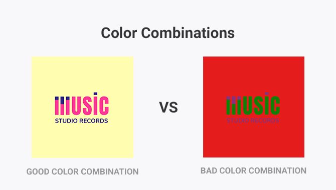
Color is a powerful tool in logo design, capable of evoking emotions and conveying brand personality. However, wielding it with precision is an art. An excessive color palette can overwhelm and confuse your audience. Opt for a balanced color scheme that aligns with your brand personality, fostering memorability without sacrificing visual harmony.
5. Font Fiascos: The Typography Tightrope
The typography you choose for your logo carries significant weight. While trendy fonts may initially appeal, they often date quickly. Prioritize readability and choose a font that aligns with your brand persona. A timeless font ensures your logo maintains its allure and relevance over time, standing as a beacon of your brand identity.
6. Inappropriate Imagery: Crafting a Thoughtful Narrative
Imagery is a potent storytelling tool, but it should be wielded responsibly. Ensure your logo’s imagery aligns seamlessly with your brand values and industry. Avoid symbols that may be misconstrued or, worse, offend your target audience. A thoughtful image enhances your brand narrative; a misguided one can tarnish it, affecting the way your brand is perceived.

7. Lack of Originality: Rising Above the Noise
In a saturated marketplace, standing out is imperative. Generic logos risk blending into the background, failing to leave a lasting impression. Craft a unique logo that reflects your brand identity and distinguishes you from competitors. Steer clear of clichés and generic symbols; instead, infuse your logo with elements that resonate with your audience on a deeper level, forging a connection that goes beyond the surface.

The Comprehensive Approach: Crafting a Timeless Logo
In conclusion, your logo is not merely a visual representation; it’s a key player in your brand’s narrative. By sidestepping these common design mistakes, you lay the groundwork for a logo that not only captures the essence of your brand but also endures the test of time. It’s an investment in the visual language that communicates your brand story, leaving a lasting impression on your audience and standing as a beacon of your brand identity in a dynamic and competitive business landscape.
A Step Further: The Collaborative Process
Beyond avoiding pitfalls, the logo design process benefits greatly from collaboration. Engaging with a skilled designer or a design agency can bring a fresh perspective and expertise to the table. Consider involving stakeholders, gather feedback, and iterate on the design to ensure it aligns seamlessly with your brand strategy.
The Ever-Evolving Visual Language
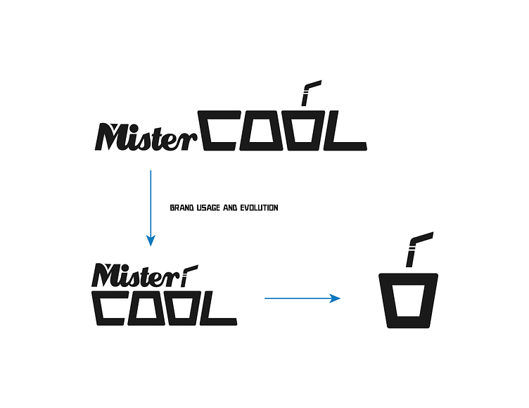
As technology and design trends evolve, so does the visual language of logos. Regularly revisit and evaluate your logo’s effectiveness in conveying your brand message. If necessary, be open to subtle modifications that align with emerging design trends while preserving the core elements that make your logo iconic.
In the grand tapestry of branding, your logo is a thread that weaves through the consumer psyche. Mastering the art of logo design involves a delicate balance of creativity, strategic thinking, and a keen understanding of your brand identity. With careful consideration and a commitment to excellence, your logo can transcend being a mere symbol, becoming a visual ambassador that resonates with your audience and stands the test of time.
