


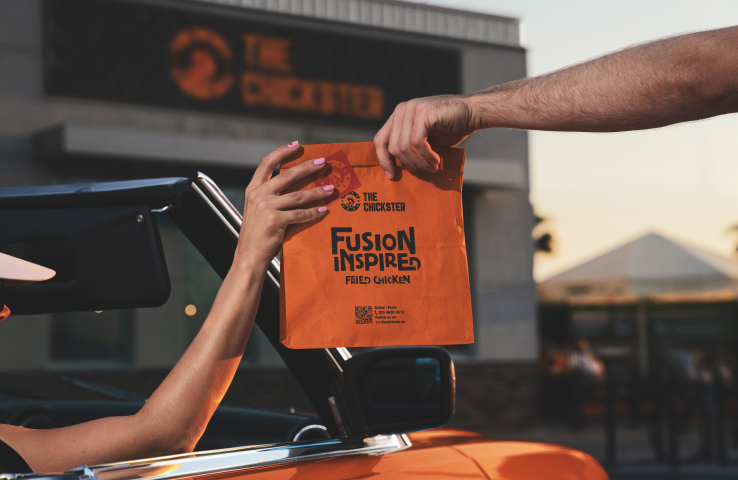
The Chickster
Built a fusion-driven packaging system that travelled with The Chickster from local outlets in Pune to its Dubai launch.
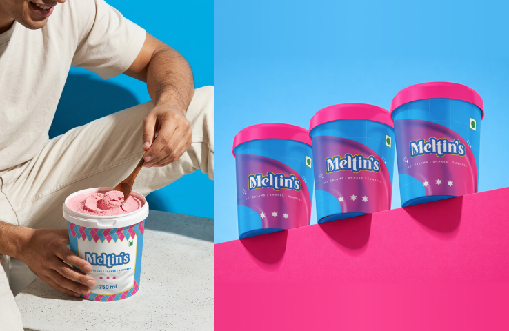
Meltin’s Ice Cream Parlour
Built a larger-than-life ice cream experience that transforms a simple dessert into a destination
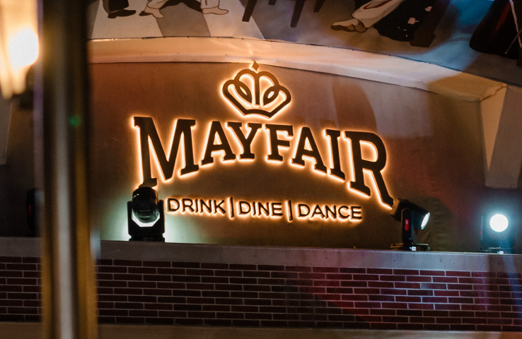
Mayfair Restrobar Branding & Experience Design
Helped transform a neighborhood dining spot into Dwarka’s most recognized nightlife destination.