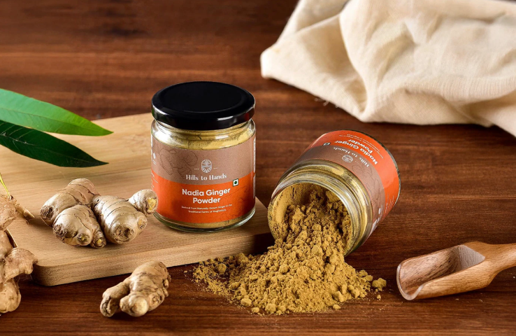
Smash Protein Bars Branding & Packaging
A bold, no-nonsense protein bar brand built to stand out in a crowded market while communicating clean nutrition.
Sector: Retail & CPG
Services: Brand Identity, Packaging Design
Year: 2024
Challenge
Smash set out to enter a crowded protein bar market dominated by exaggerated health claims and overdesigned packaging.
The challenge was to create a brand that communicated clean nutrition, performance credibility, and taste confidence without sounding preachy or looking generic. The identity needed to appeal to disciplined, active consumers while remaining clear, honest, and easy to trust
Solution
Performance-First Brand System: Built a bold and loud identity that puts nutritional clarity and product honesty at the forefront. The visual language and tone were designed to feel direct, confident, and no-nonsense.
Packaging & Flavor Architecture: Designed a structured packaging system across flavours that balances strong shelf impact with clear nutritional communication, making SMASH instantly recognizable and easy to choose.
Three Flavours, One Vision
Blueberry
Choco Brownie
Cookies and Cream
Use Persona Research
Before designing the identity and packaging system, we studied the lifestyle and decision patterns of urban consumers most likely to buy protein bars.
Persona mapping revealed two key segments: young professionals building healthier routines and mid-career professionals prioritising long-term health and family wellbeing.
Key Insights
• Health-conscious but time poor
Busy corporate lifestyles make convenience and portability critical.
• Clarity builds trust
Consumers prefer straightforward nutrition communication over complex fitness jargon.
• Relatable performance
Buyers are everyday professionals balancing work, fitness, and lifestyle goals.
• Taste drives consistency
Healthy products must feel enjoyable enough to become a daily habit.
The Moodboard
Creative Direction
Bold and expressive wordmarks with playful distortions and graphic shapes. The direction favors strong lettering that feels energetic, memorable, and packed with personality.
Logo Direction
The moodboard explores a playful & high-energy brand world inspired by modern snack culture. The objective was to create a brand that feels fun, loud, and instantly recognizable.
Color Palette
A vibrant palette led by electric blues and punchy yellows. The high contrast keeps the brand visually loud and ensures strong shelf visibility.
Typography Direction
Playful, chunky typography that feels bold and dynamic. Letterforms stretch and shift to add movement, energy, and a distinct brand voice.
Packaging Direction
Packaging focuses on bold color blocking, large typography, and clear product communication.
Strategic Logo Exploration
Using insights from the moodboard, competition analysis & positioning sliders, we explored 30+ logo concepts to translate SMASH’s strategy into a distinctive identity for the Protein Bar Brand.
KEY CONSIDERATIONS:
Strategy-Led Identity
Each concept was evaluated against the brand positioning to create a modern, confident, and approachable nutrition brand, avoiding typical gym-focused visuals.
Category Differentiation
Most protein bar brands rely on aggressive fitness cues. We focused on a clean, bold logo that improves shelf recognition and brand recall.
Defining Packaging System
A structured layout was developed to ensure the most important information was instantly visible on shelf. The brand name, flavour, protein quantity, and product benefits were prioritised to improve clarity and retail recognition.
Distinct colour systems were created for each flavour, allowing the range to feel unified while making it easy for consumers to quickly identify variants.
AI-Led Visual Creation
To accelerate the early stages of communication, a no-photography approach was adopted. All visuals and videos were crafted using AI, enabling the team to produce highly accurate imagery without waiting for traditional photoshoots.
This approach helped the founders quickly overcome their initial content challenges, giving them high-quality visual assets and faster momentum without losing time on complex production setups.
Consistent Brand Experience Across Touchpoints
The brand was carefully carried forward across every touchpoint, including social media and the website, ensuring that the visual language and communication intent remained consistent everywhere the audience encountered it.
This continuity helped reinforce recognition and trust, allowing the brand to appear unified and intentional without breaking the narrative established through the identity system.
Team
Brand Strategy & Creative direction: Chirag Puri
Graphic design & Illustration: Pulkit Gupta, Chirag Puri
Copywriting & Content Strategy: Vibha Sharma
More Good Stuff

Hills to Hands
Built a farm-to-consumer spice brand that highlights the journey from India’s hills directly to the kitchen.

Sow Good Vegan Milk
Sow Good is a Vegan Milk band that translated plant-based nutrition into a premium, shelf-ready identity designed to scale across SKUs and formats.
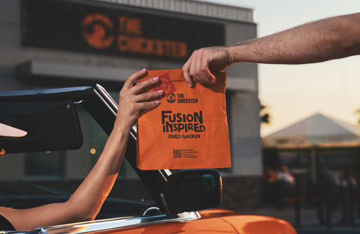
The Chickster
Built a fusion-driven packaging system that travelled with The Chickster from local outlets in Pune to its Dubai launch.