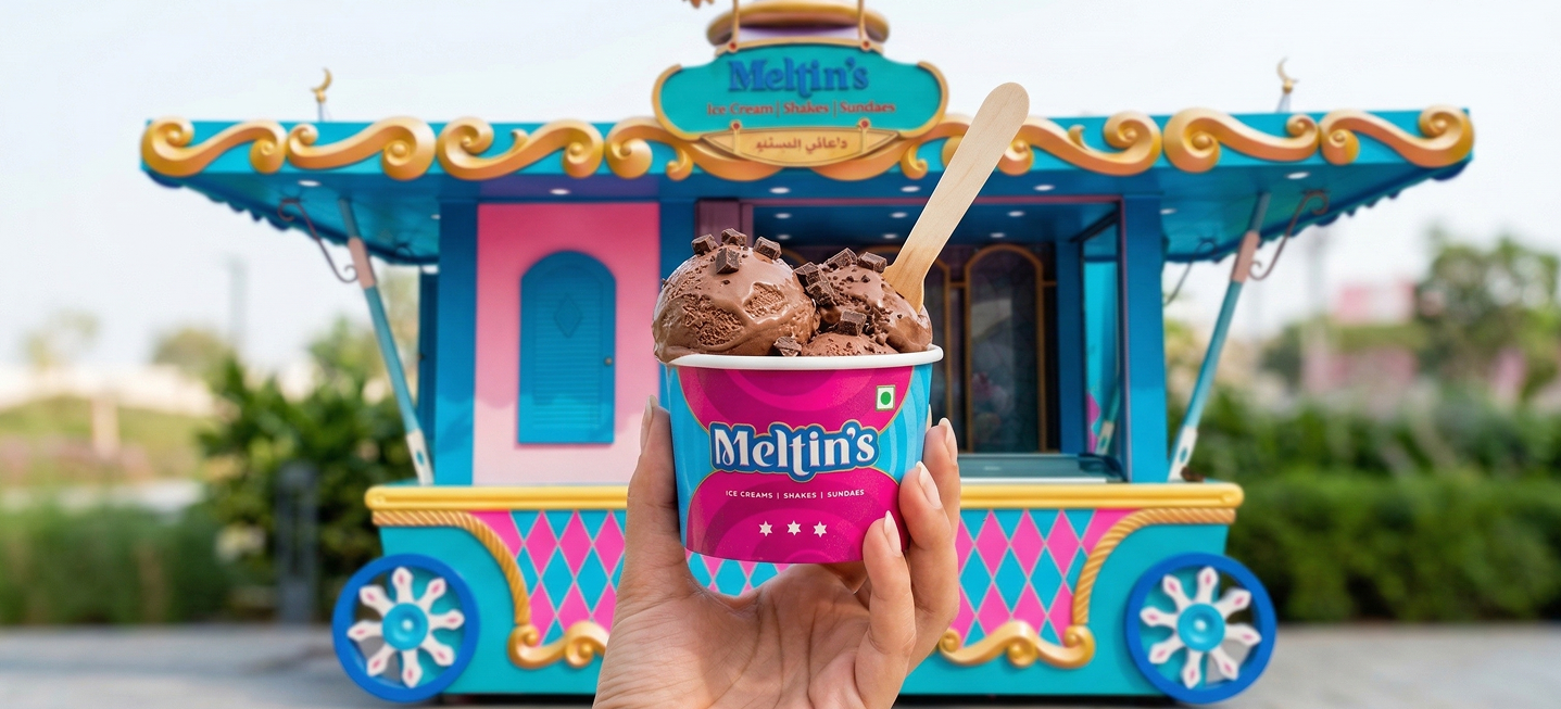


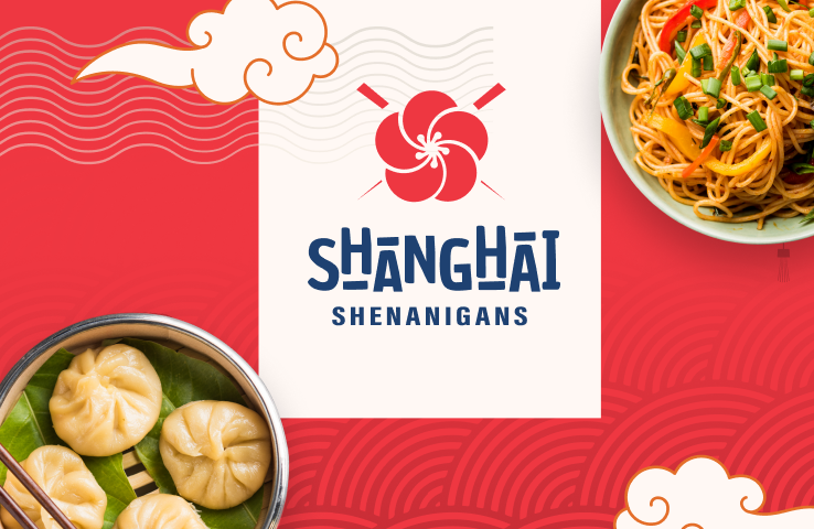
Shanghai Shenanigans
A bold, Pan-Asian food brand based in New Delhi, launched as a delivery-first kitchen
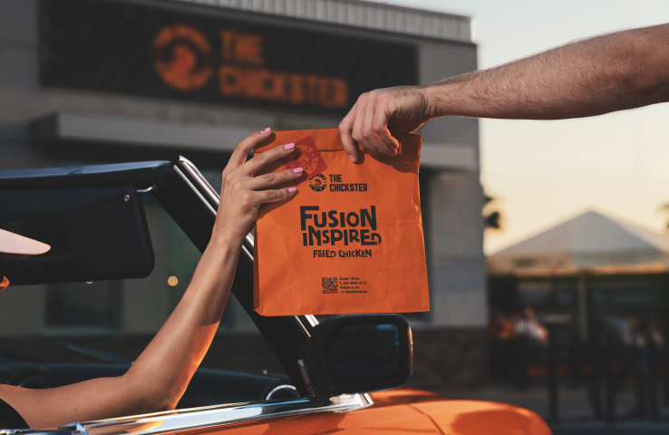
The Chickster
Built a fusion-driven packaging system that travelled with The Chickster from local outlets in Pune to its Dubai launch.
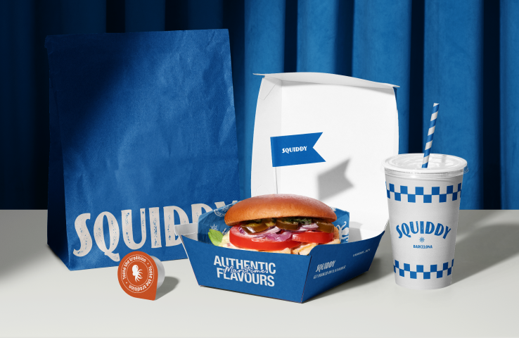
Squiddy
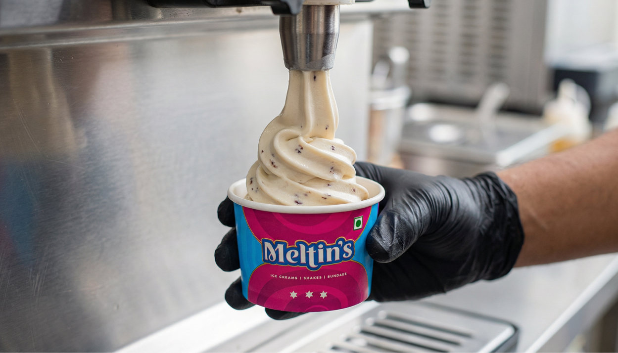
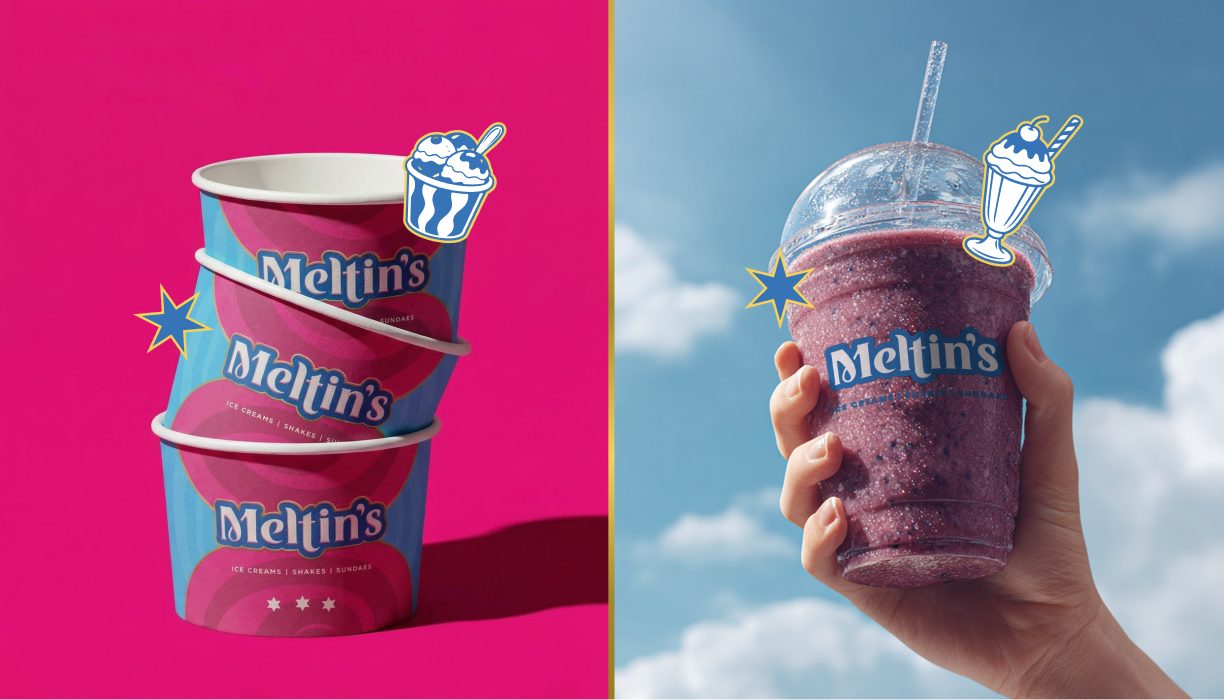
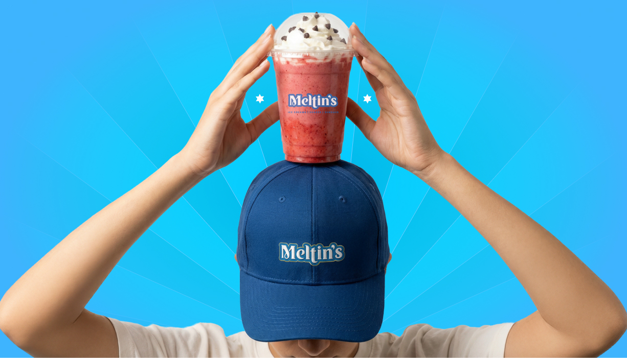
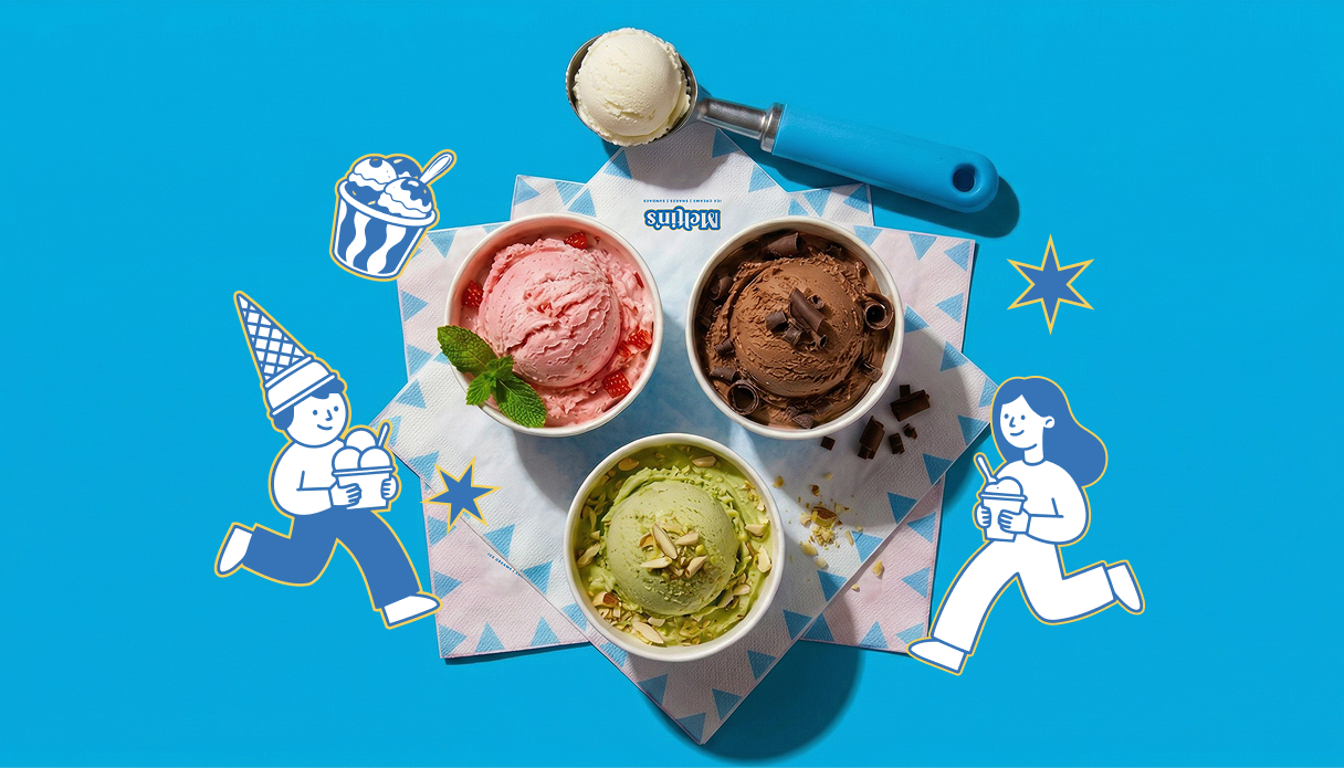
A fast-paced seafood QSR brand built around bold flavours, quick service, and a sharp, recognisable packaging system.