Sow Good
Sector: Cloud Kitchen
Services: Visual Identity, Packaging Design
Year: 2023
Challenge
Position Sow Good as a premium vegan plant drink brand in a crowded market. Communicate the brand’s commitment to sustainability and wellness.
Solution
The Visual Identity, and Packaging elements were designed to reflect the purity of the plant-based ingredients, incorporating organic shapes and a soothing yet vibrant color palette inspired by nature.
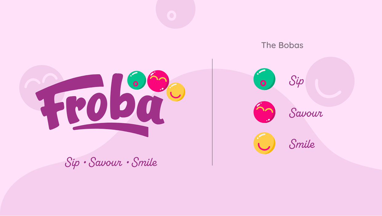

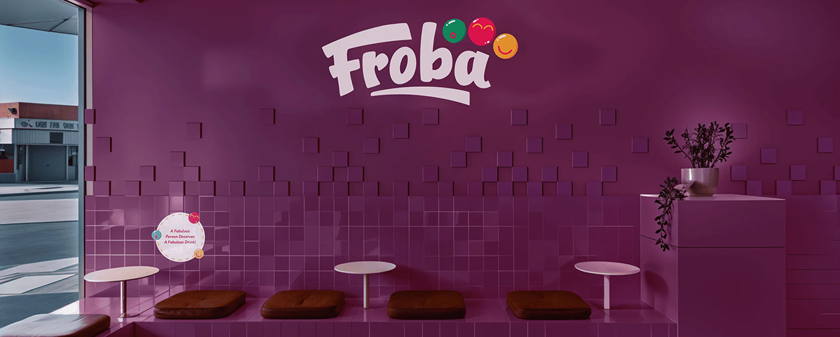
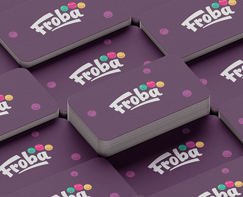
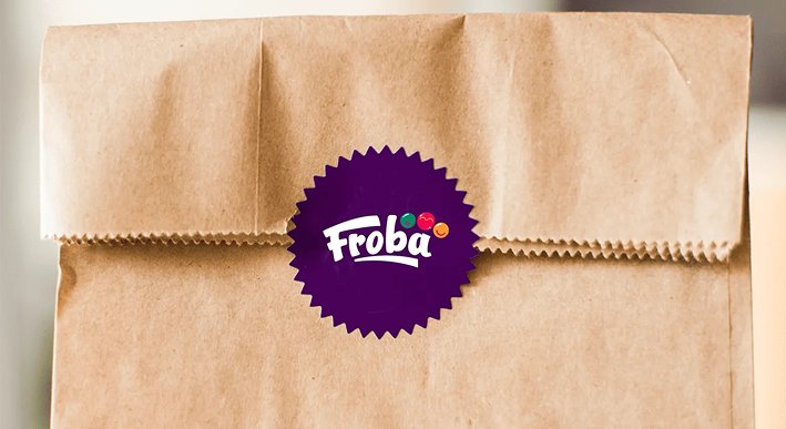
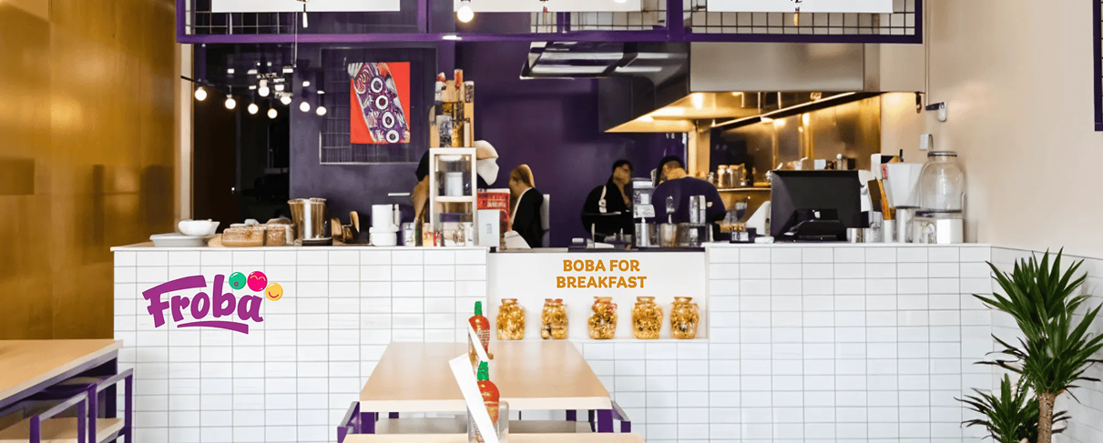
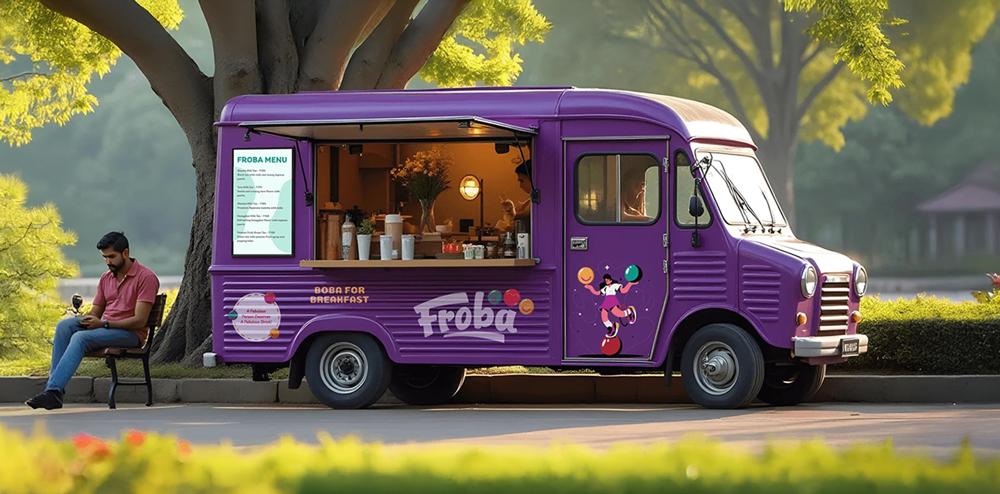
We developed a vibrant identity system that mirrors the playful spirit of the brand. The bold colour palette, expressive logo and cheerful packaging design work together to create a sense of joy and connection. Every touchpoint, from store interiors to take-away boxes, reflects Froba’s mission to make everyday moments feel bright and memorable.
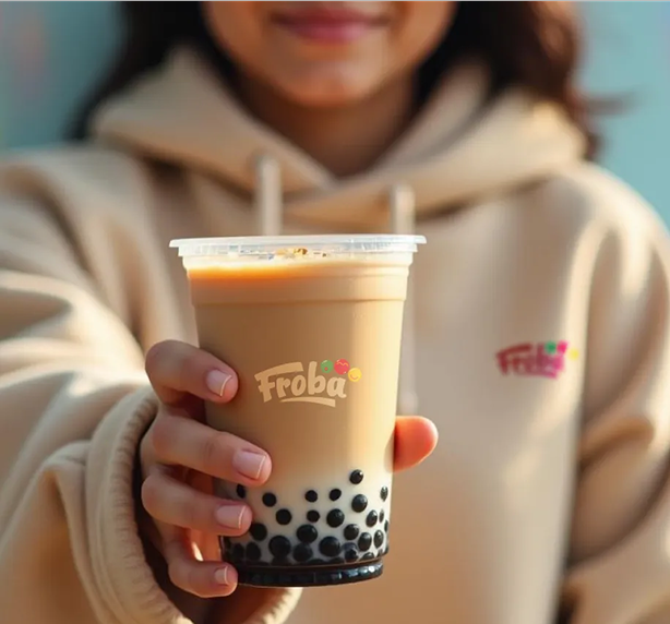
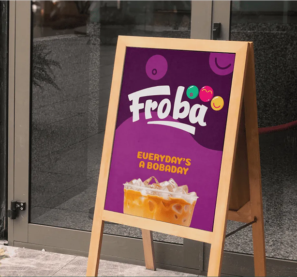
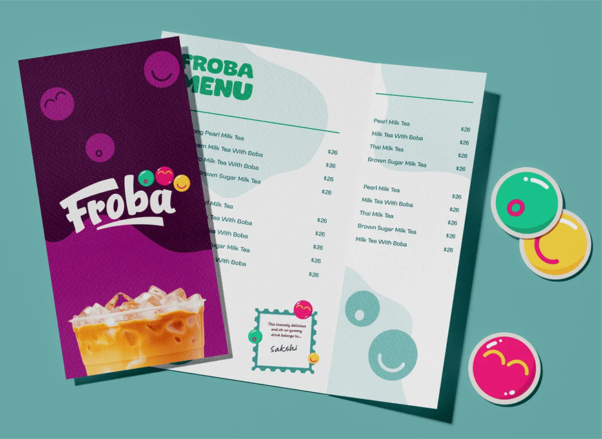
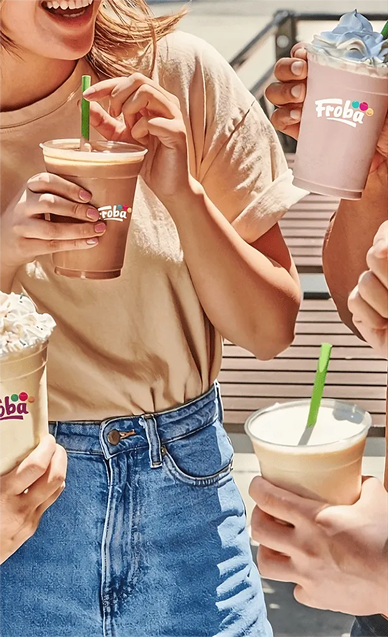
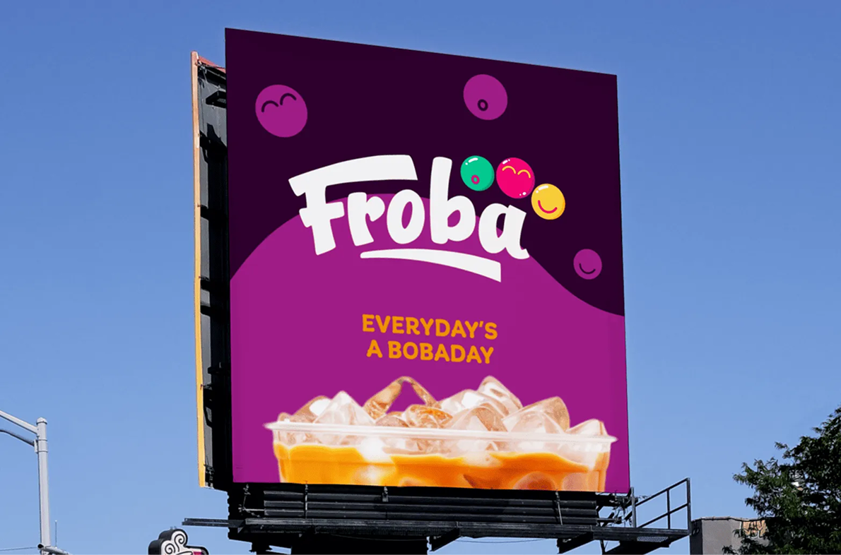
We extended the identity into packaging, menus and campaign visuals that radiate energy and playfulness. Each element captures the upbeat essence of the brand and connects with its young, expressive audience. From the first sip to the final scroll, Froba’s world feels colourful, modern and full of joy.
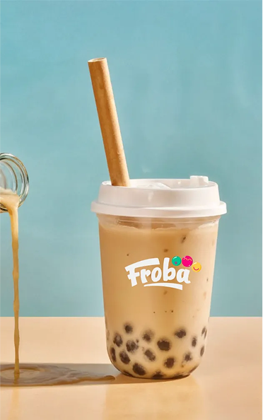
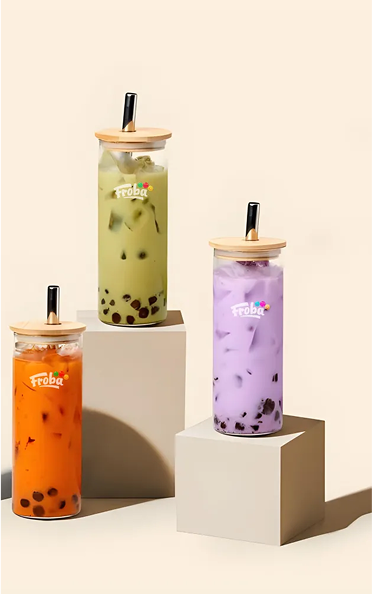
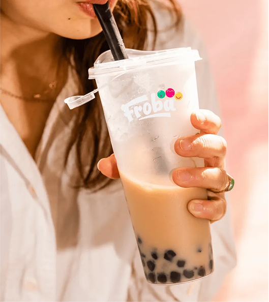
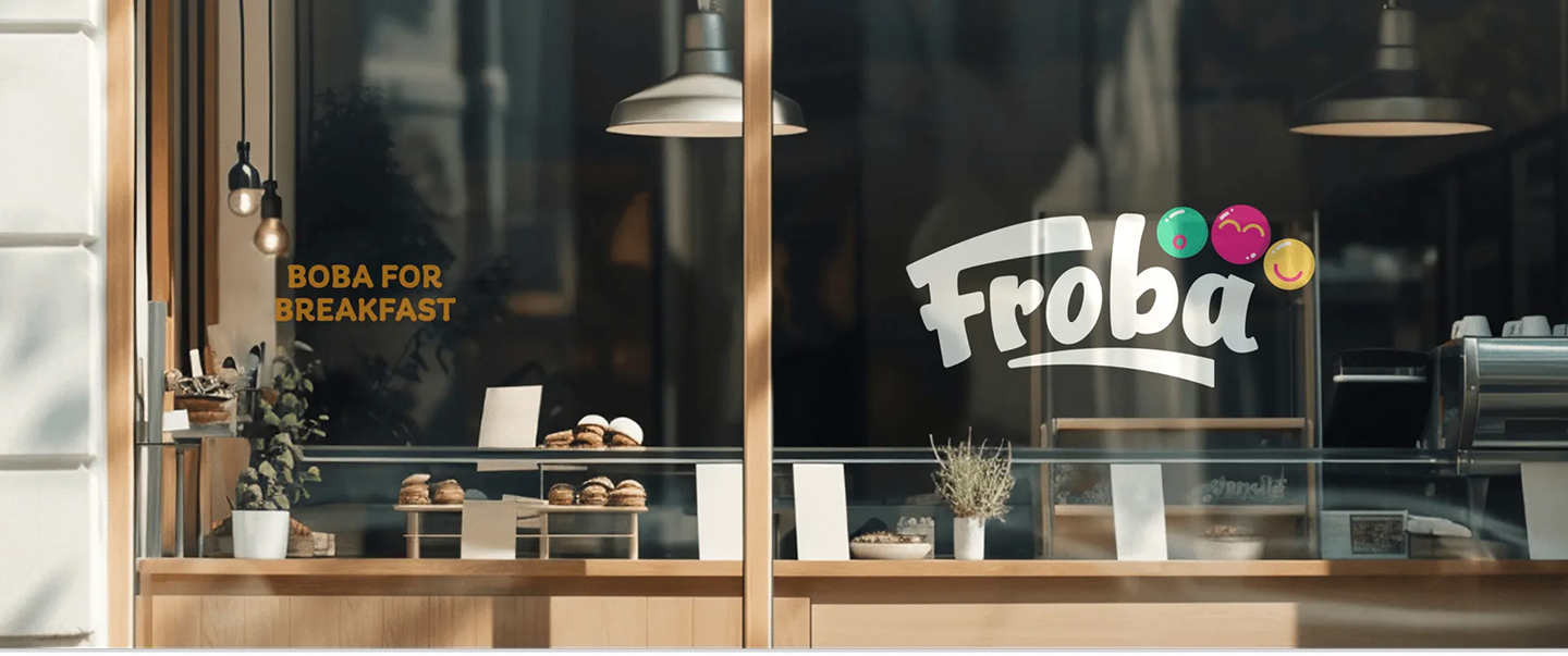
The visual identity featured bright colour palettes, playful shapes and fluid typography that reflected the movement and fun of bubble tea culture. This cohesive system ensured Froba looked fresh, consistent and instantly recognisable across every platform and space.
