Built a clarity-first brand and packaging system for Sow Good that translated plant-based nutrition into a premium, shelf-ready identity designed to scale across SKUs and formats.
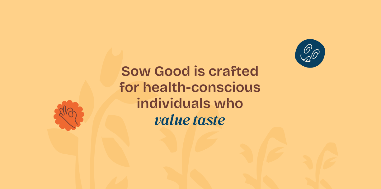
Sow Good entered a rapidly growing plant-based beverage market where most brands leaned either too clinical or overly generic. The challenge was to position the brand as premium yet approachable, while clearly communicating its vegan, health-first promise.
The system needed to balance education and aspiration, help consumers understand plant-based benefits instantly, while creating strong shelf recall. It also had to scale seamlessly across SKUs like oats and almond without losing consistency or clarity.
Solution
We built a brand identity rooted in clarity, warmth, and natural goodness, translating Sow Good’s philosophy into a visual system that feels both nutritious and desirable.
From logo to packaging, every element was designed to simplify decision-making—highlighting key benefits, creating a distinctive visual language, and enabling easy SKU differentiation. The result is a cohesive system that strengthens shelf presence while supporting future product expansion.
Establishing Communication Pillars
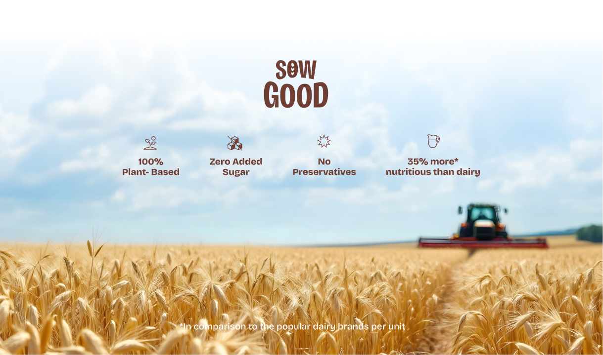
We defined clear communication pillars centered on plant-based purity, nutritional transparency, and everyday usability. Each touchpoint reinforces simple, benefit-led messaging, ensuring consumers quickly understand what the product offers, why it matters, and how it fits into their daily lifestyle.
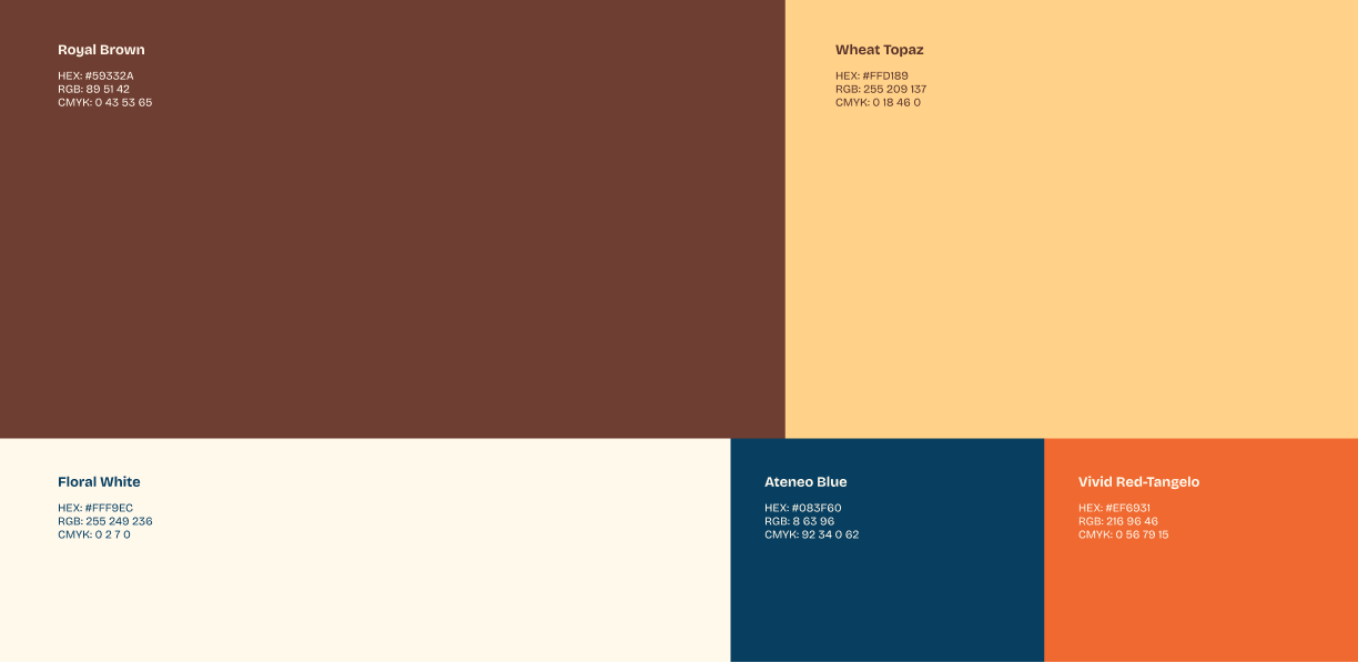
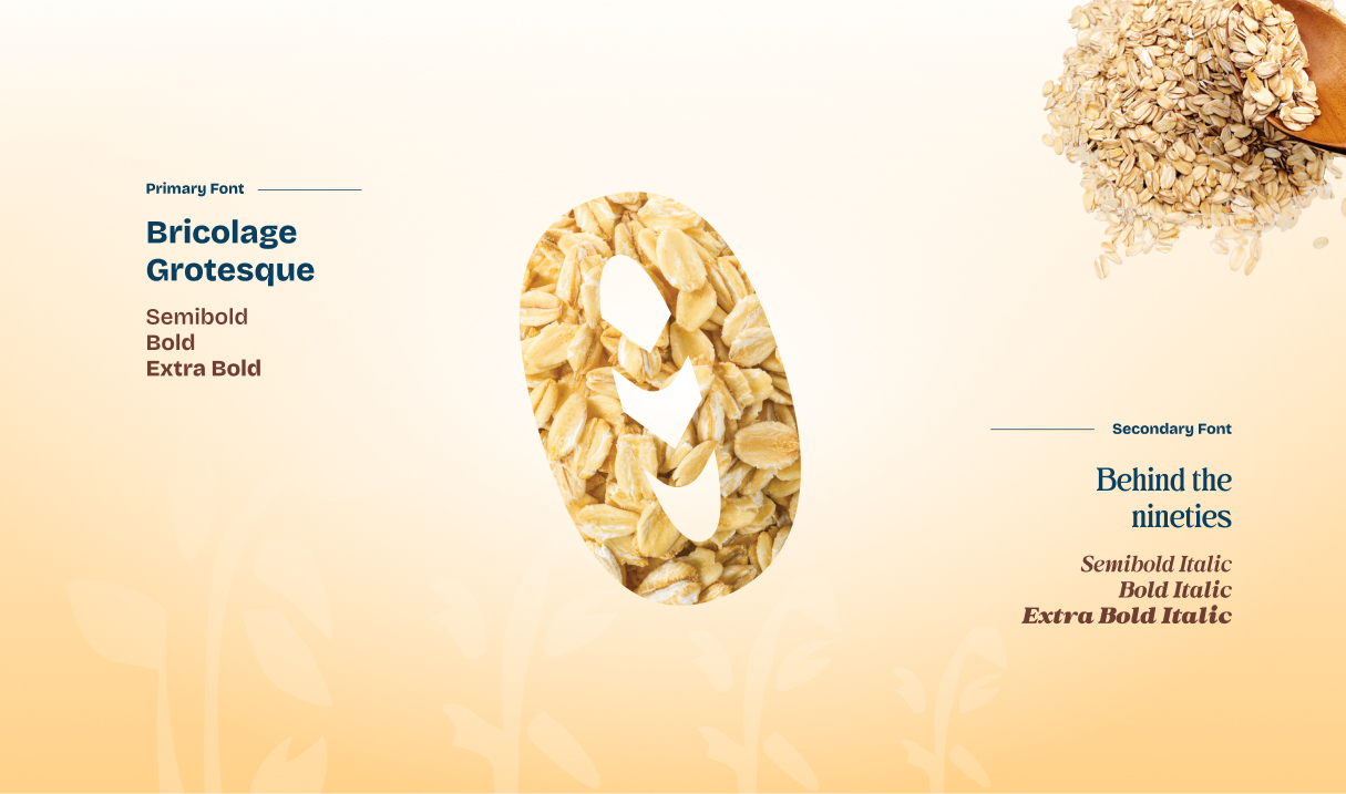
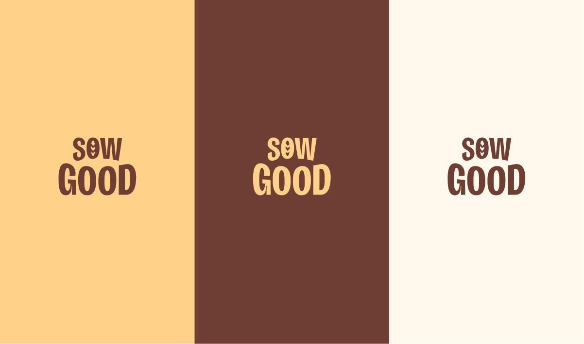
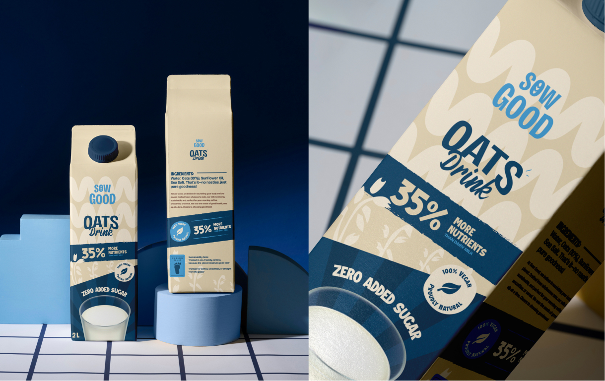
Color and Typography
The visual foundation combines earthy neutrals with vibrant accents to reflect natural ingredients and modern appeal. A structured typography system balances bold clarity with soft warmth, ensuring readability across packaging while maintaining a premium, approachable tone across all brand applications.
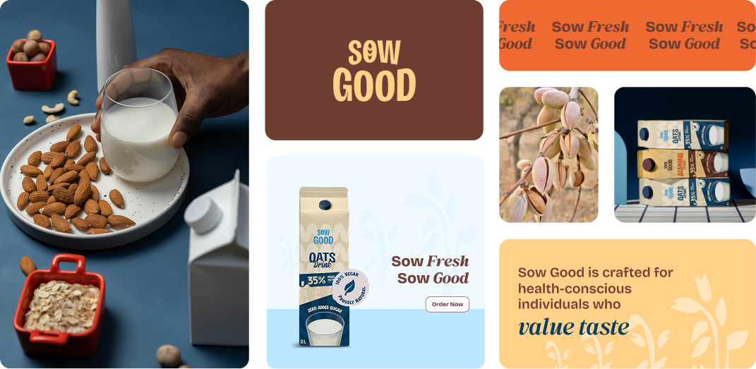
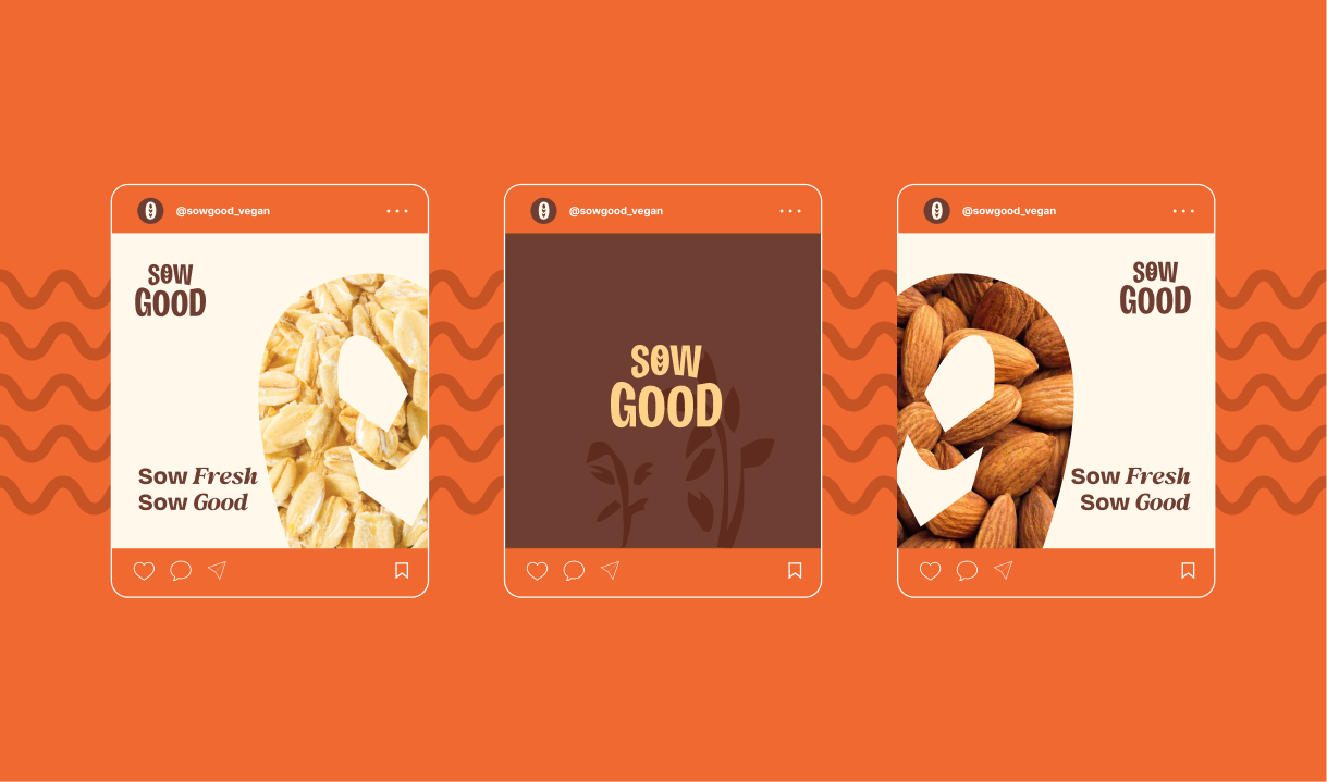
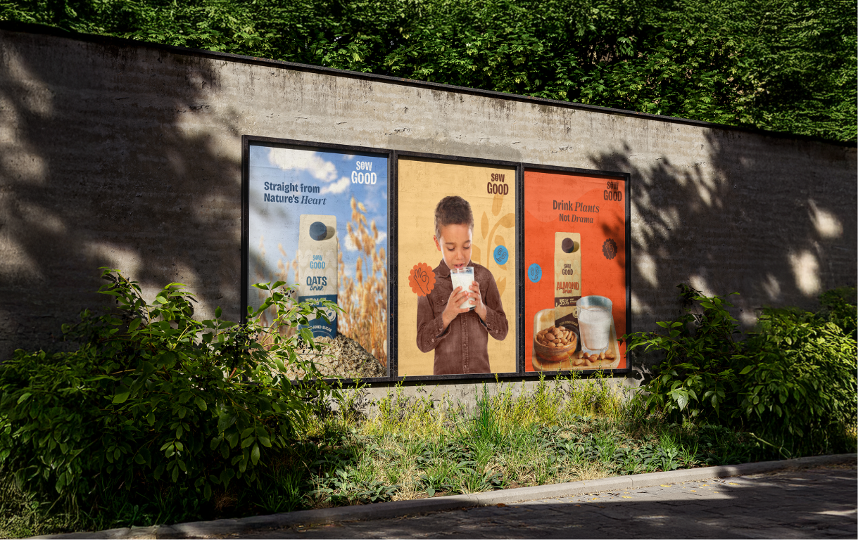
Digital & Offline Media Activation
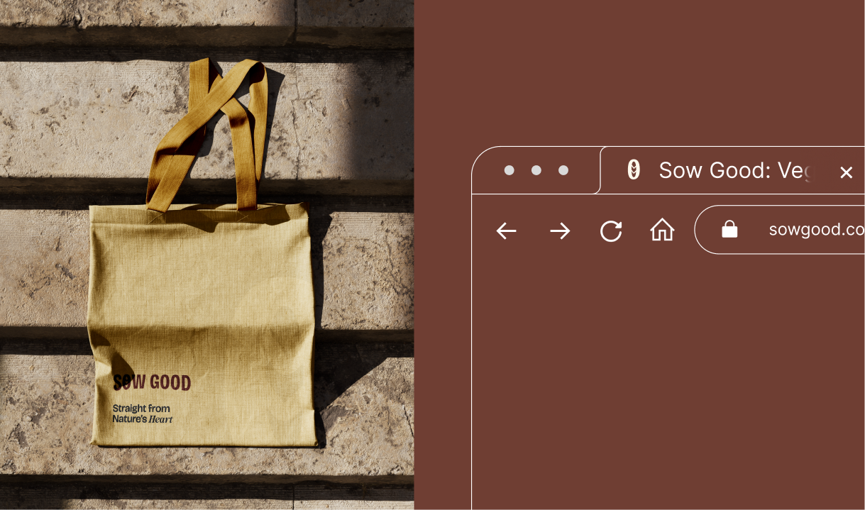
The brand system extends seamlessly into digital and physical spaces, creating consistent storytelling across social media, retail, and outdoor. From product-first visuals to lifestyle-driven communication, every touchpoint reinforces Sow Good’s positioning as a modern, health-conscious plant-based brand.
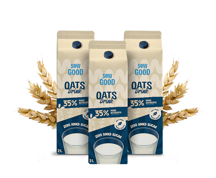
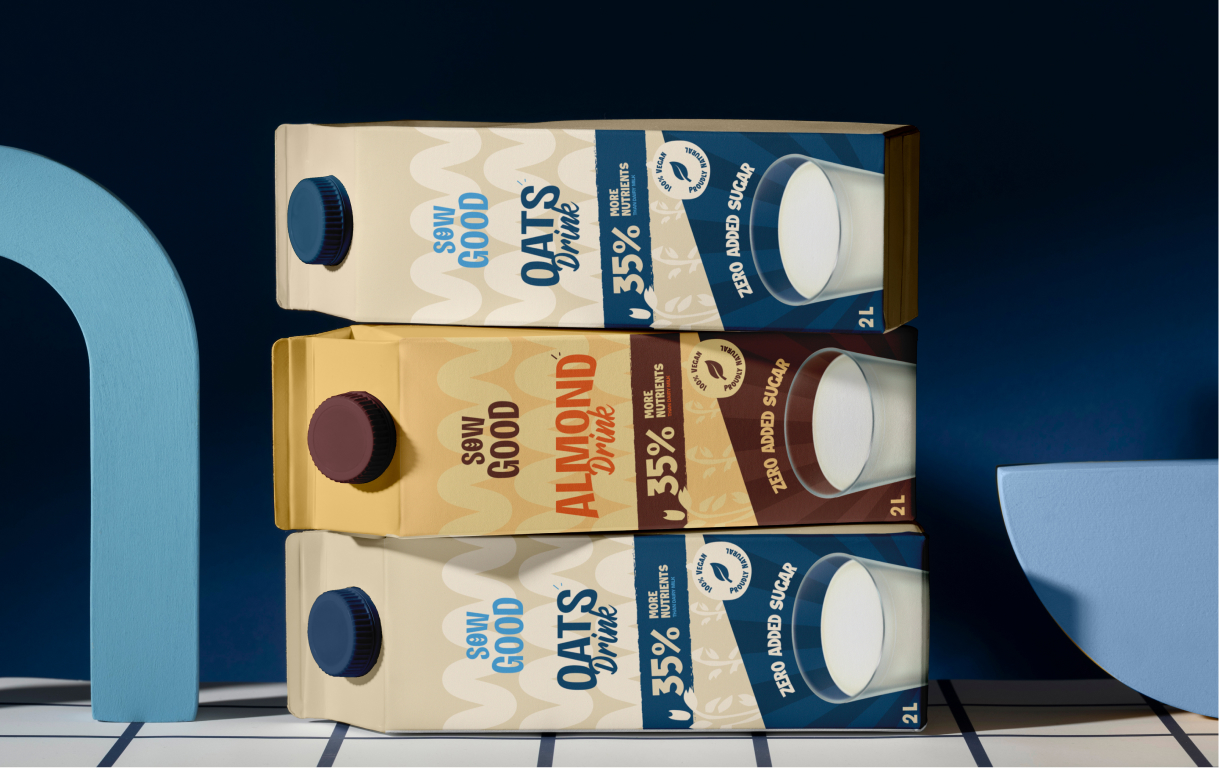
2 SKUs: Oat Drink & Almond Drink
We designed a flexible packaging system for Oats and Almond variants, using color, ingredient storytelling, and clear hierarchy to differentiate while staying consistent.
The term “Drink” replaces “Milk” to align with regulations, while still communicating familiarity, usage, and everyday relevance.
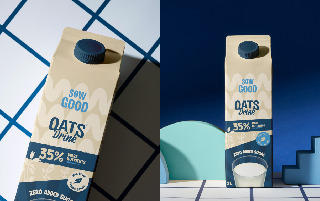
Oats Drink
Oats Drink focuses on comfort, nutrition, and daily versatility. The visual language highlights grain richness and health benefits, making it ideal for everyday consumption while reinforcing its plant-based, lactose-free positioning in a familiar and approachable format.
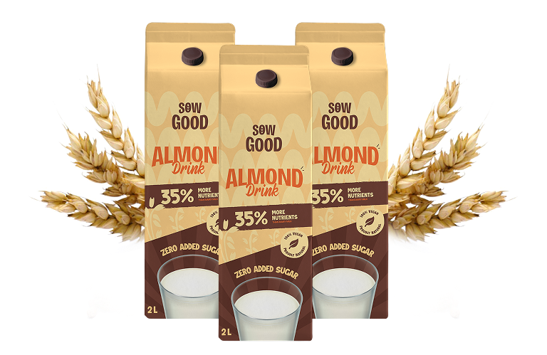
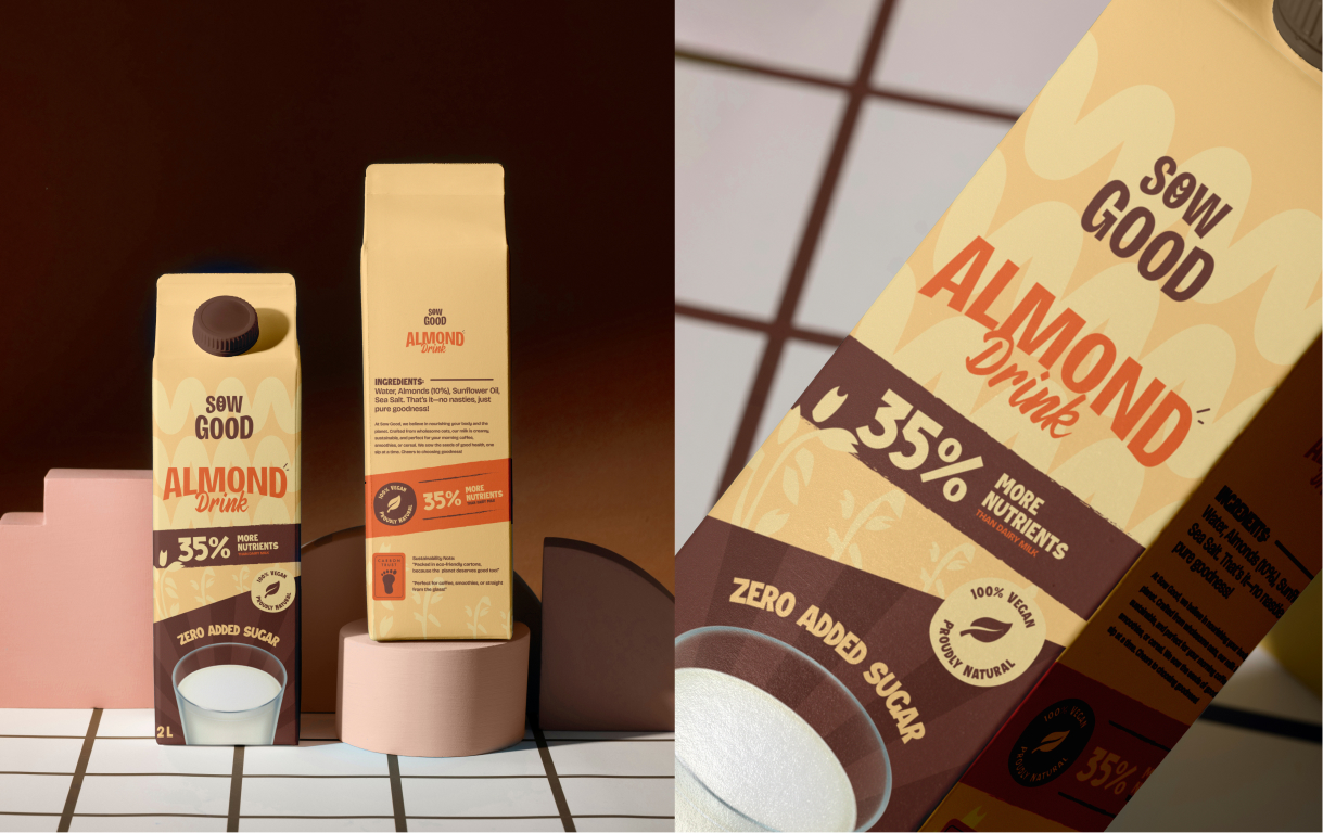
Almond Drink
Almond Drink is positioned as a lighter, premium alternative, emphasizing taste and wellness. The design highlights ingredient purity and indulgence, creating a perception of sophistication while maintaining clarity around its nutritional value and plant-based origin.
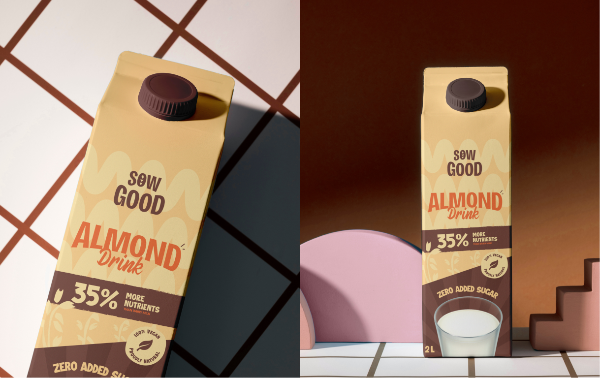
Almond Drink
Almond Drink is positioned as a lighter, premium alternative, emphasizing taste and wellness. The design highlights ingredient purity and indulgence, creating a perception of sophistication while maintaining clarity around its nutritional value and plant-based origin.