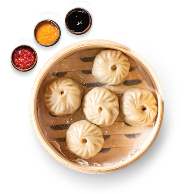
Momoscape entered a highly saturated cloud kitchen space in Delhi NCR, where most momo brands relied on similar offerings and lacked any strong visual differentiation.
The challenge was to create a visual identity that could stand out instantly on platforms like Zomato and Swiggy, while appealing to a young, expressive, and socially active audience that makes quick, scroll-driven decisions.
Solution
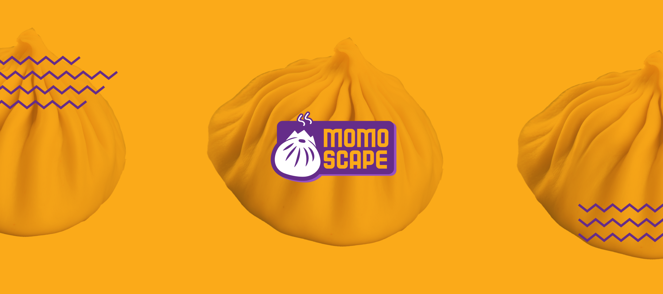
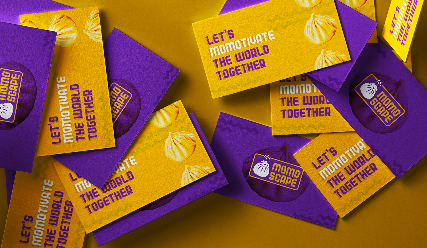
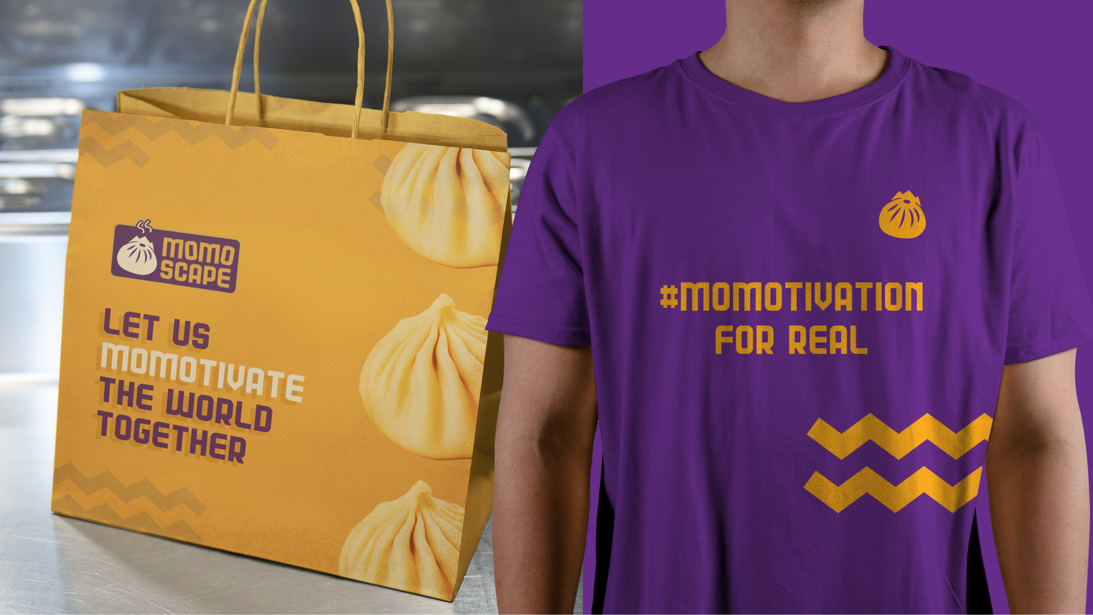
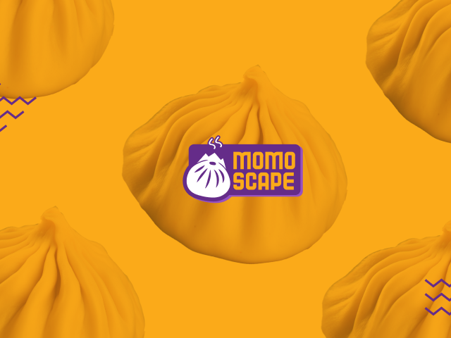
We developed a bold and distinctive visual identity centered around a momo icon with rising smoke, designed to create instant recall and recognition.
The system was applied consistently across packaging and digital touchpoints, using high-contrast visuals and a lively tone to ensure the brand felt energetic, relatable, and impossible to miss in a crowded feed.
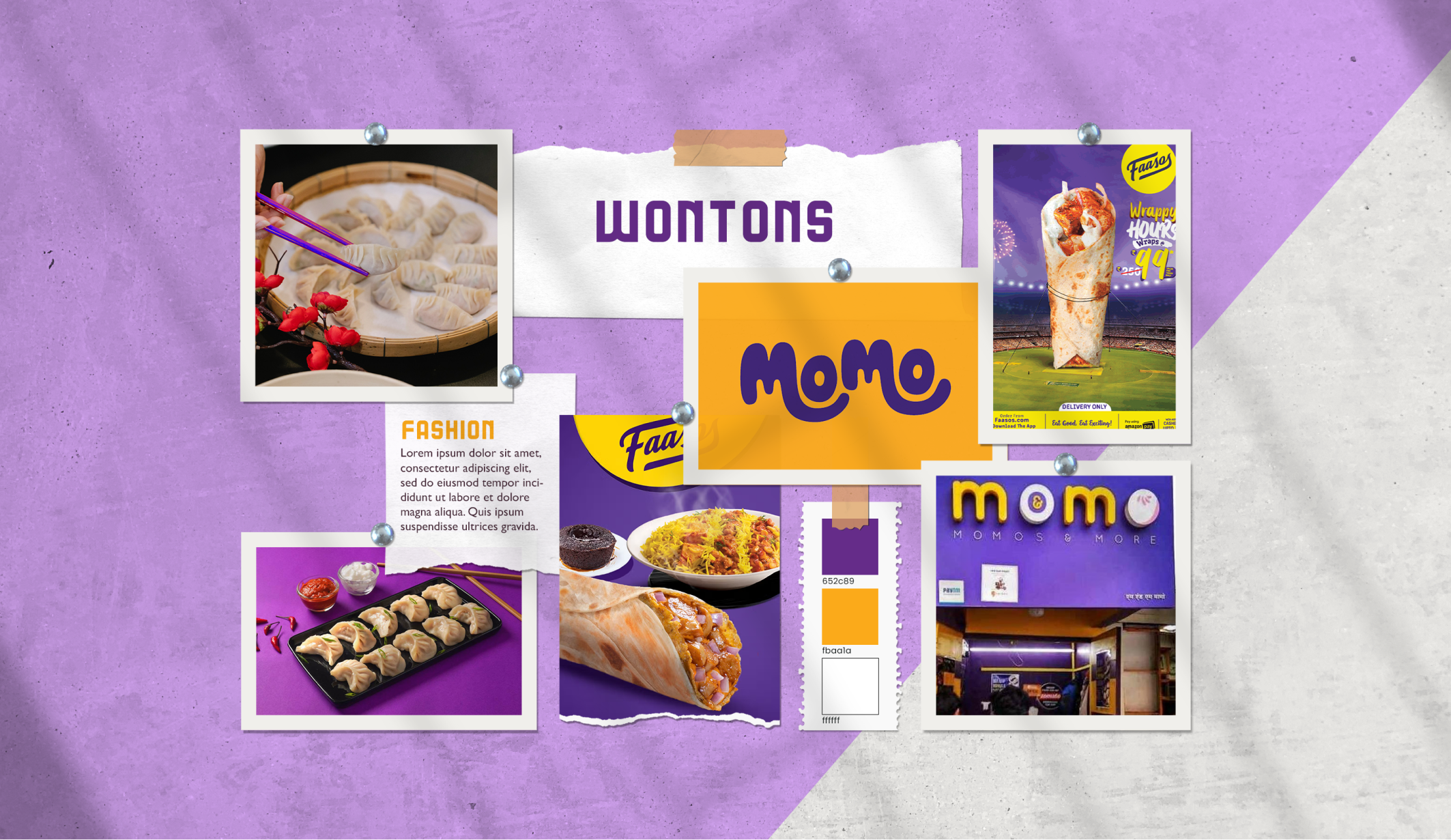
Brand Discovery
We began the Momoscape project with a structured brand discovery process, using a detailed questionnaire to understand the brand vision, target audience, and positioning within the cloud kitchen and food delivery space.
This initial research, combined with category analysis of momo brands in Delhi NCR, helped define a clear visual direction focused on differentiation across platforms like Zomato and Swiggy.
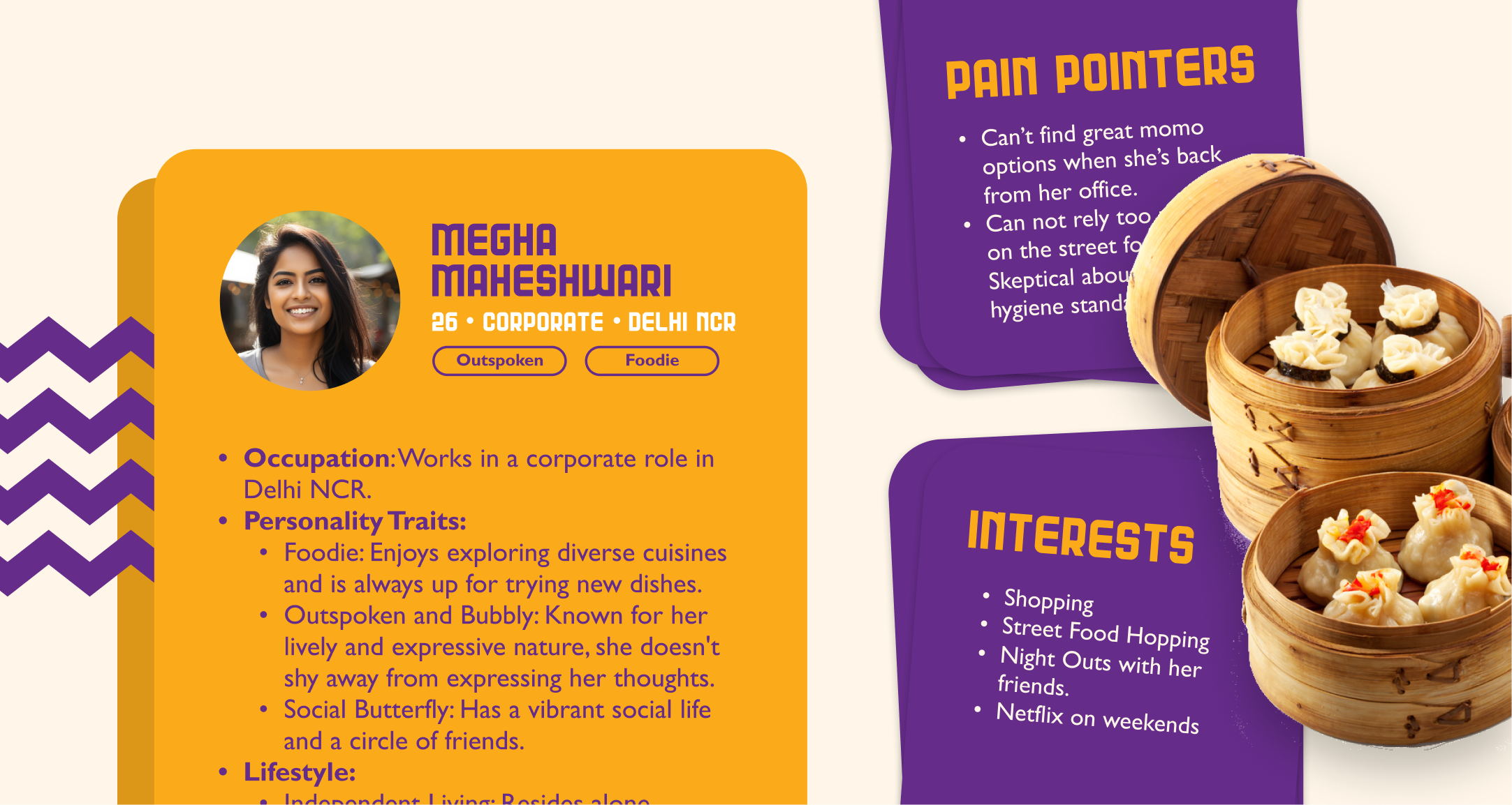
User Persona Research
The visual identity was designed for a young, urban, working professional in Delhi NCR who frequently orders food online and explores new cuisines.
This tech-savvy, social audience values convenience, aesthetics, and brand personality, guiding a design approach that feels bold, engaging, and optimized for food delivery app browsing behavior.
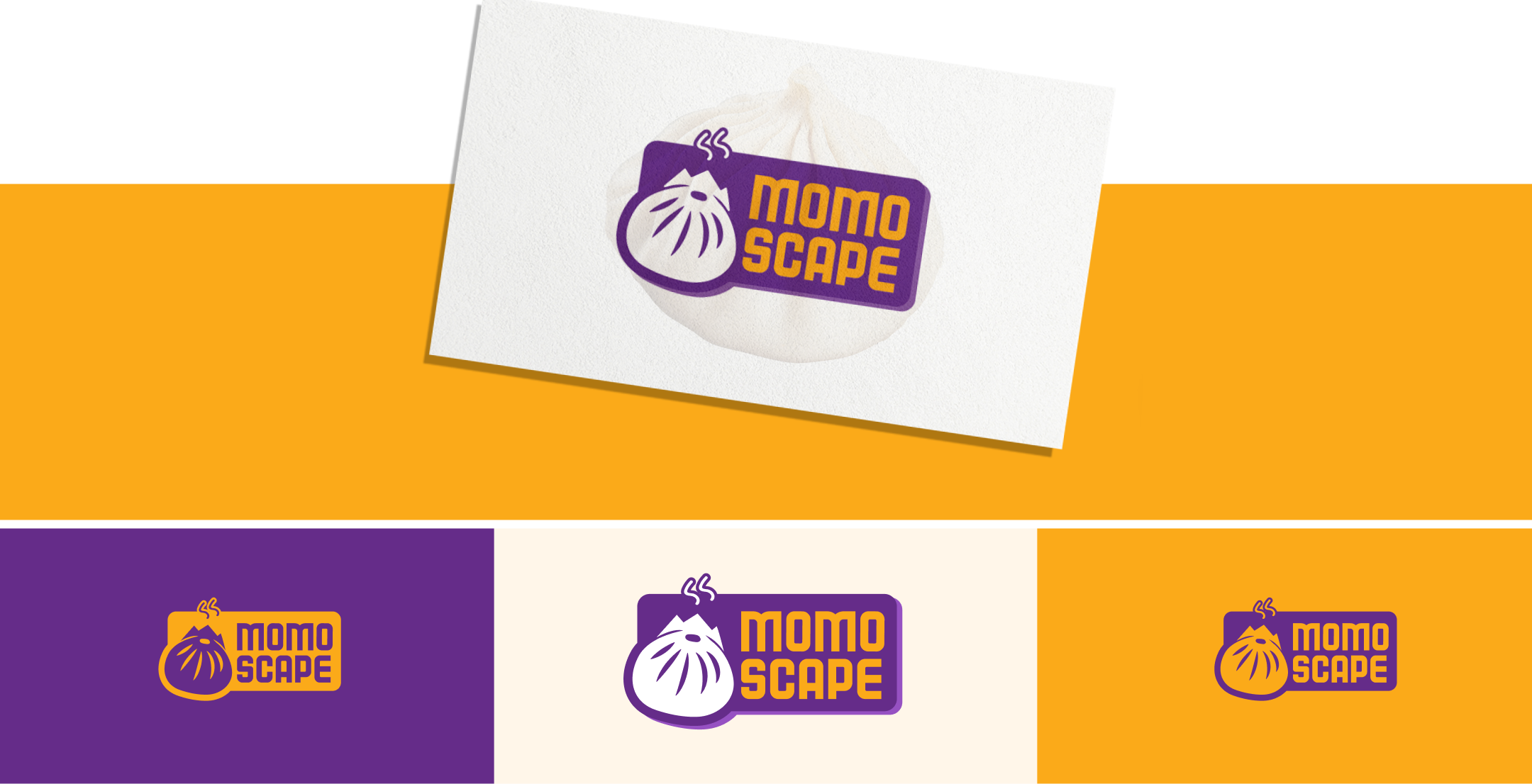
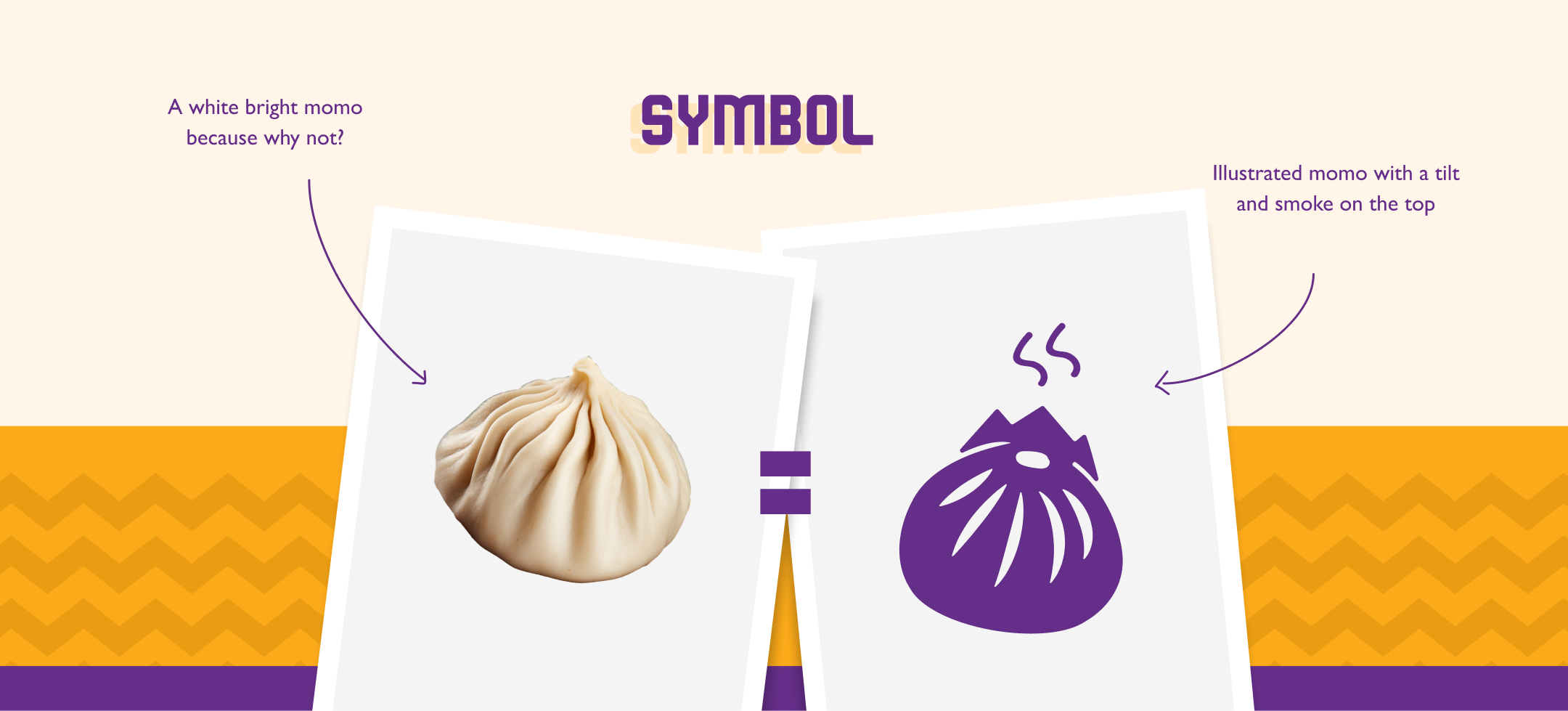
Logo Direction
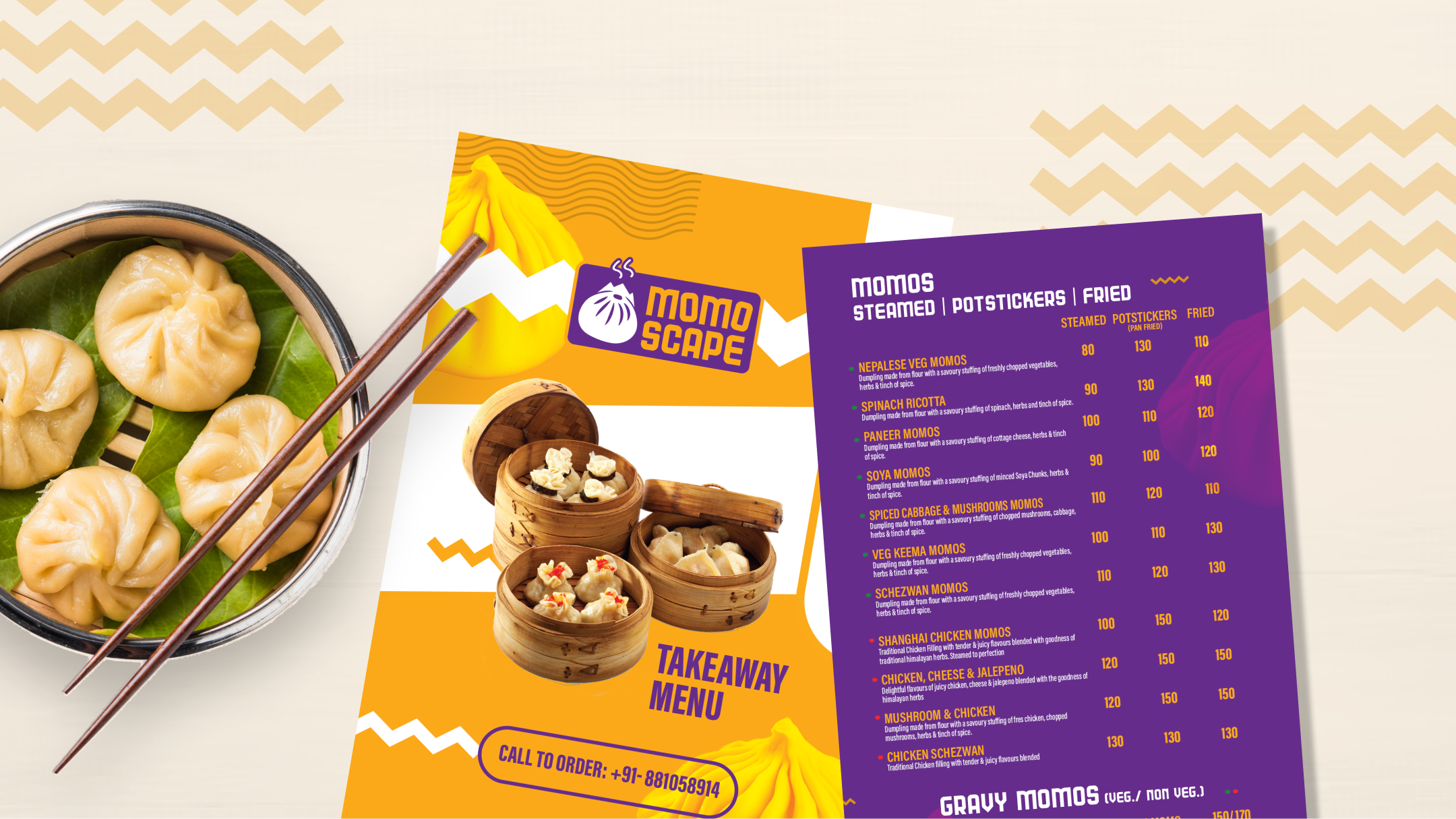
The Momoscape logo was crafted as a distinctive visual identity mark featuring a momo with rising steam, symbolizing freshness and flavor.
Combined with a strong typographic structure, the logo was designed for high visibility, brand recall, and scalability across digital platforms, packaging design, and cloud kitchen branding touchpoints.
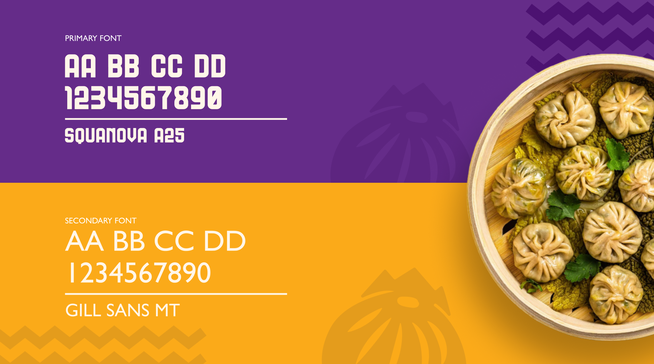
Typography & Colors
A clean and modern typography system was selected to ensure readability across mobile screens, food delivery apps, and packaging formats.
The color palette was designed to be vibrant and high-contrast, helping the brand stand out in crowded food delivery interfaces and improving visual recognition in competitive cloud kitchen environments.
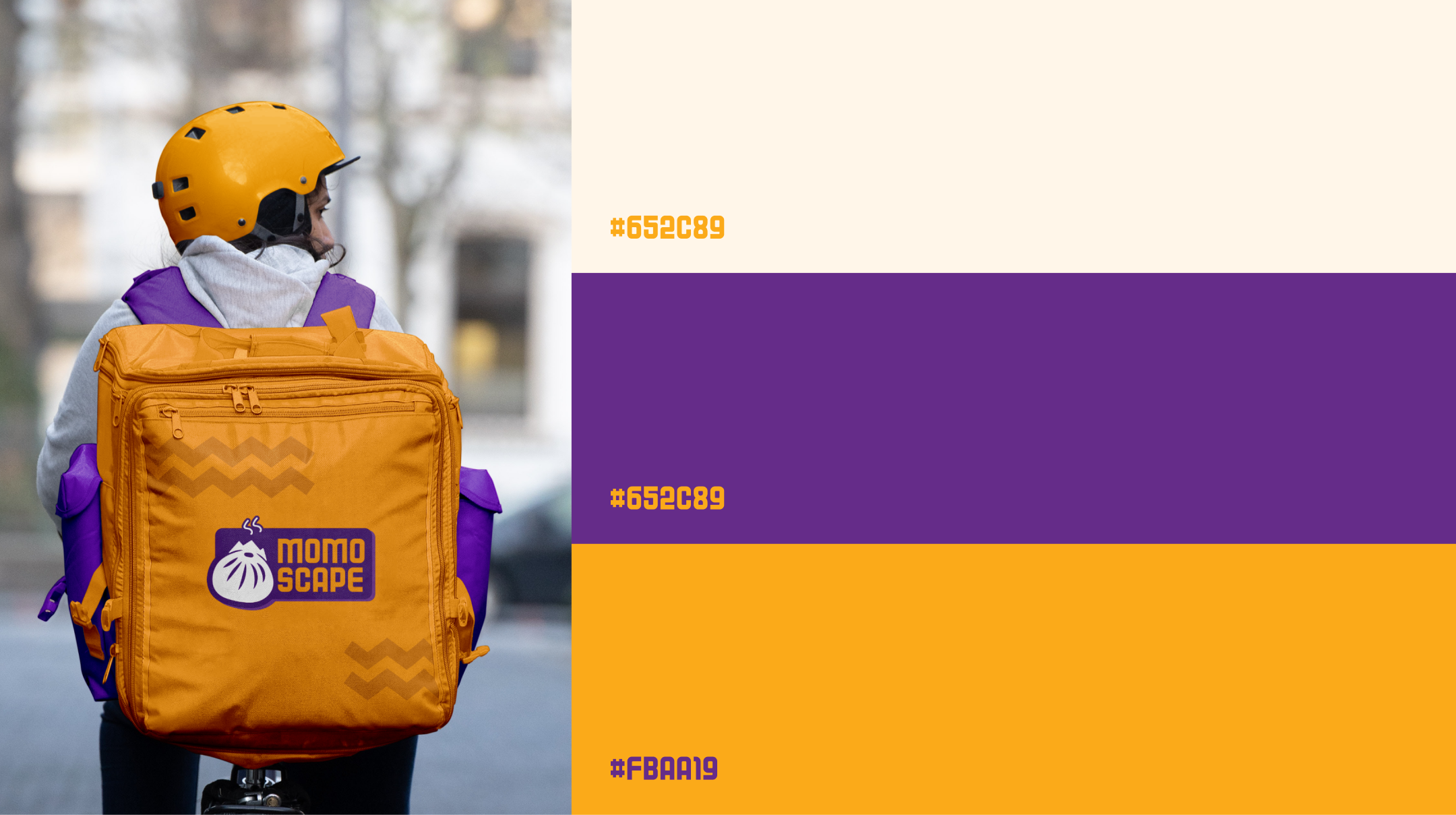
Application & Usage
The visual identity system was applied across packaging design, food delivery listings, and brand collaterals to ensure consistency and recognition.