Squiddy, a Barcelona-based seafood QSR, was preparing to scale its on-ground presence in a highly competitive street food environment. The challenge was to translate the existing brand identity into a packaging system without altering or reinventing the brand itself.
The system needed to work seamlessly across multiple formats, from dine-in to takeaway, while maintaining consistency, clarity, and strong visual recall in a fast-moving QSR setting.
Solution
We developed a cohesive packaging system strictly aligned with Squiddy’s existing brand guidelines. The focus was on structure, hierarchy, and adaptability across formats.
Each packaging element was designed to feel unified, instantly recognisable, and practical for quick service environments. The visual language was extended across in-store touchpoints as well, ensuring a consistent and immersive brand experience throughout.
The result positioned Squiddy as a sharp, memorable seafood QSR in Barcelona, with a packaging system that supports both operational speed and strong brand recall.
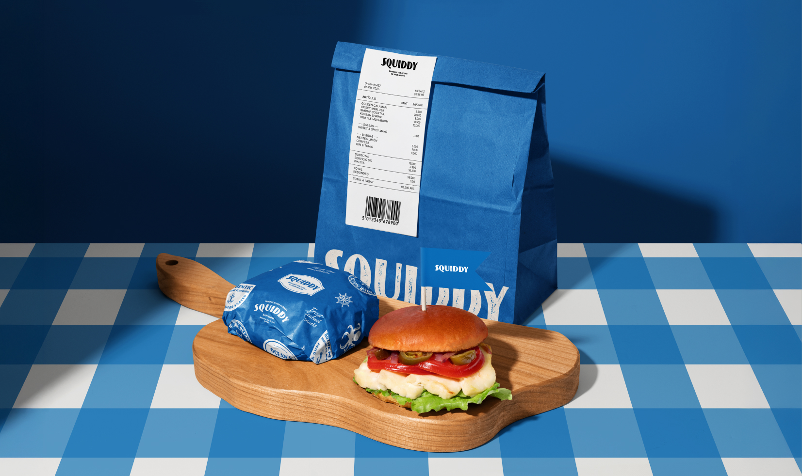
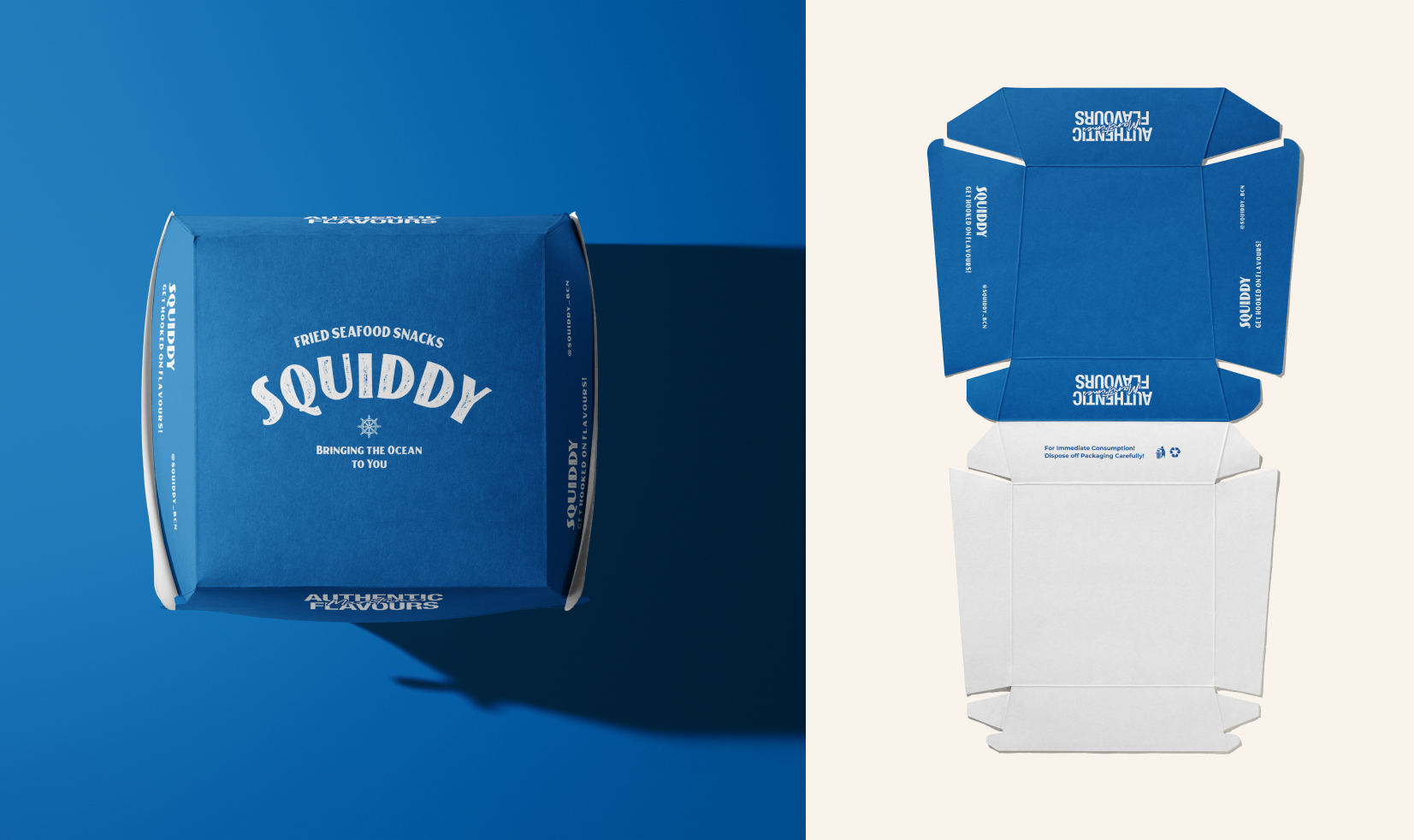
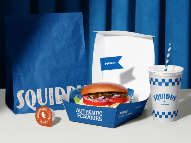
Packaging Design
The packaging system was strategically designed to ensure brand consistency across multiple SKUs while maintaining flexibility for different product formats within a fast-paced QSR environment.
A strong focus on visual hierarchy, clear labeling, and structured layouts ensured that each pack remained easy to navigate, highly functional, and instantly recognisable on shelves and in takeaway settings.
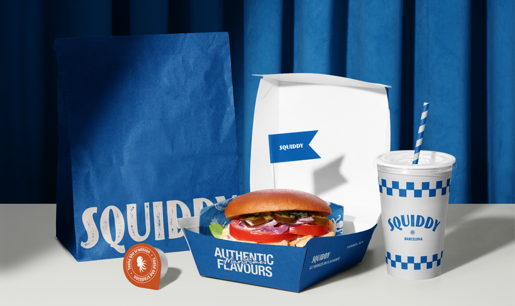
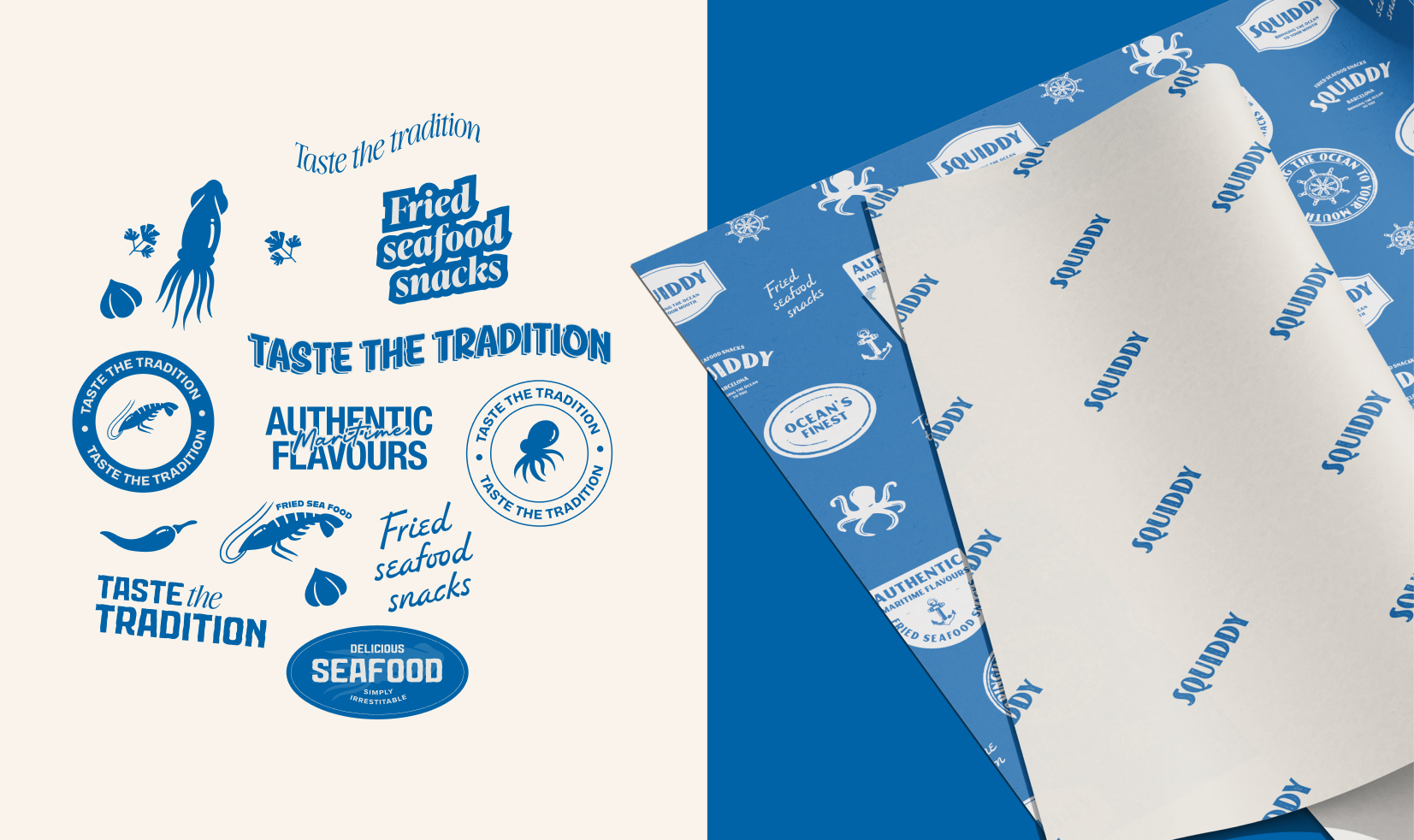
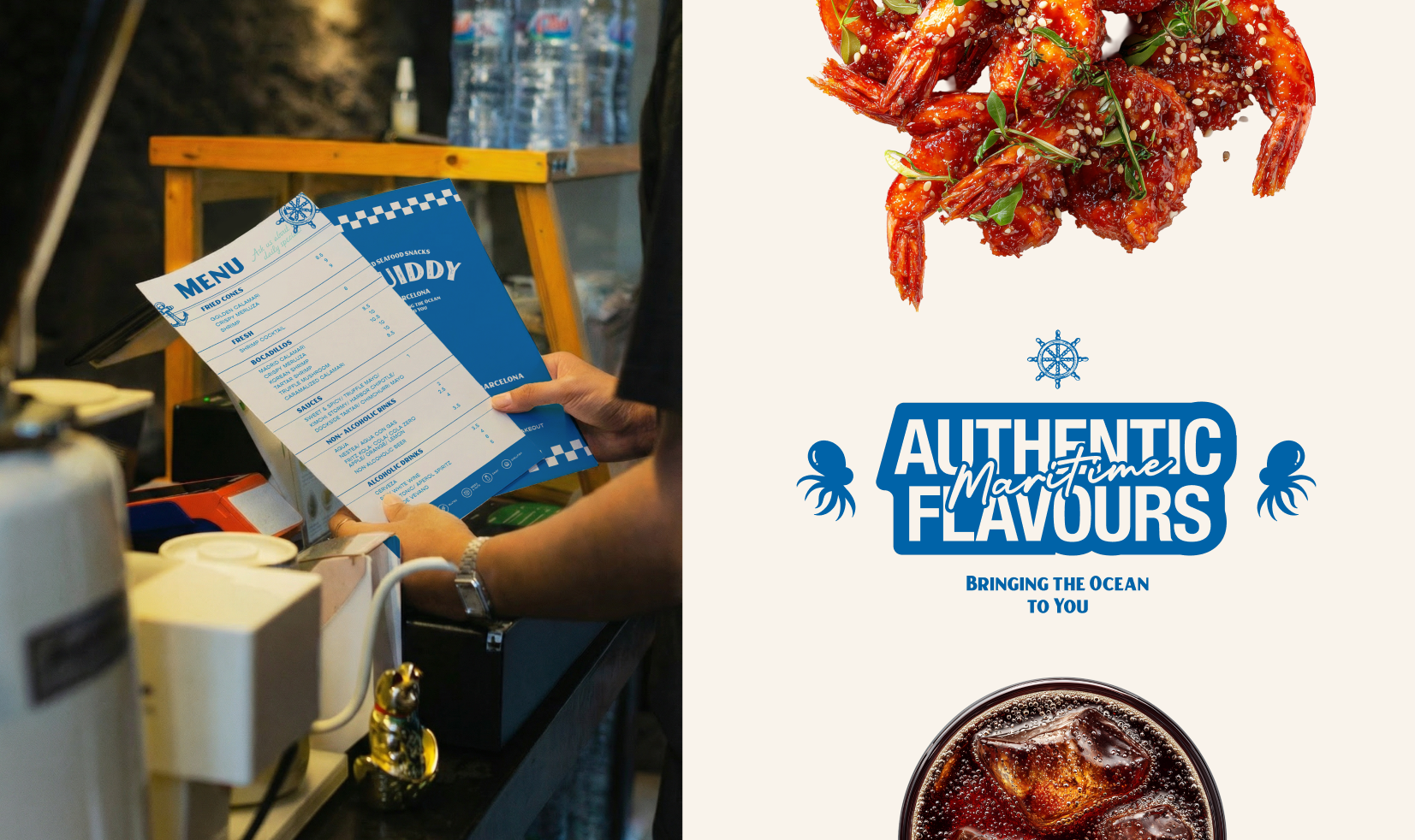
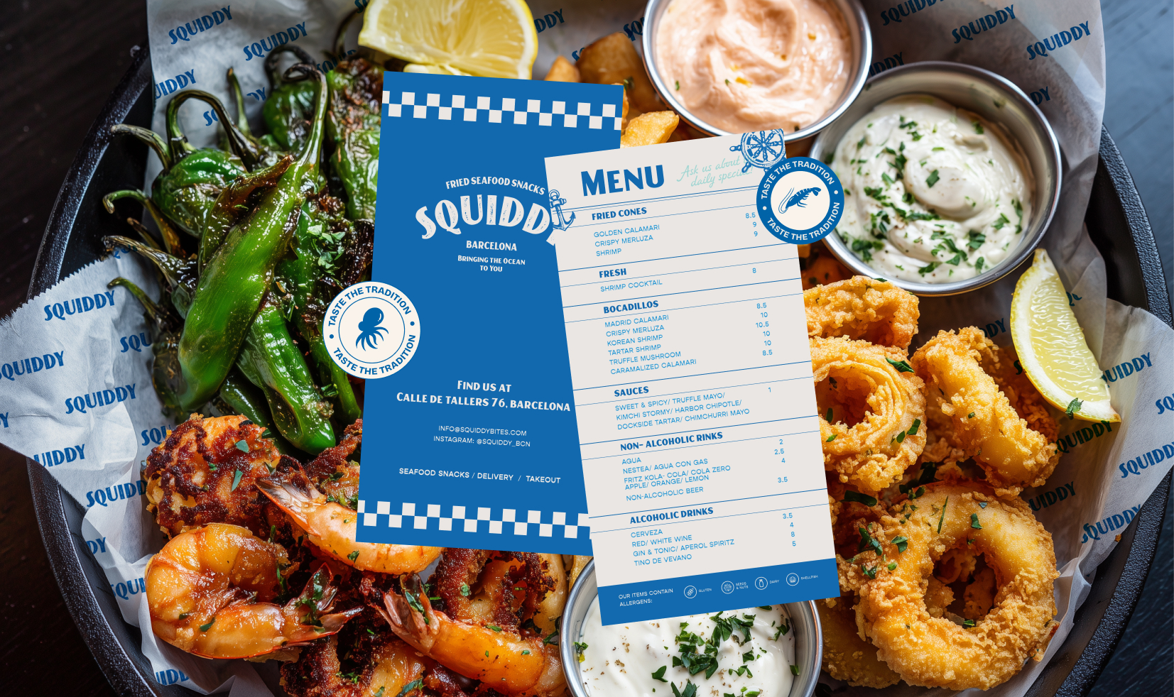
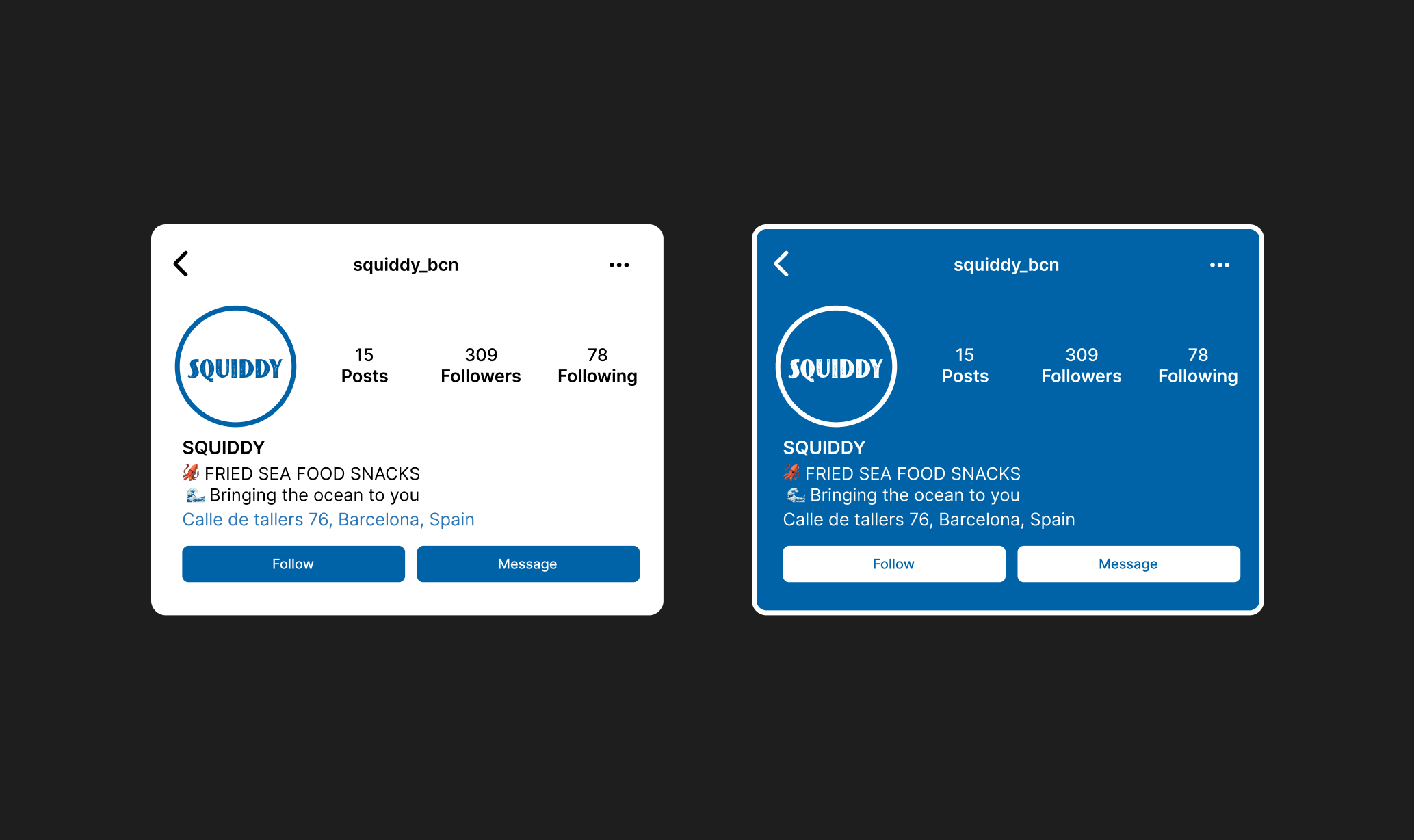
Recallable Assets & IPs Packaging
We helped build a set of distinctive, recall-driven brand assets that function as a recognisable IP for Squiddy, strengthening its visual storytelling across touchpoints.
These elements were designed to be easily replicable across packaging, stickers, menus, merchandise and in-store applications, ensuring consistency while enhancing brand recall in a fast-paced QSR environment.
The system not only improves visual cohesion but also creates a memorable brand language that customers can instantly associate with the Squiddy experience.
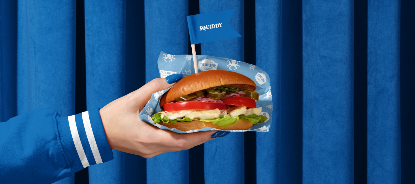
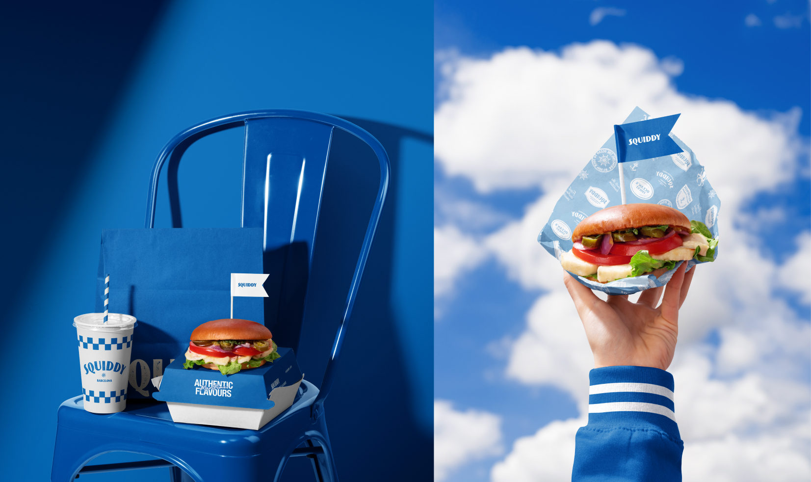
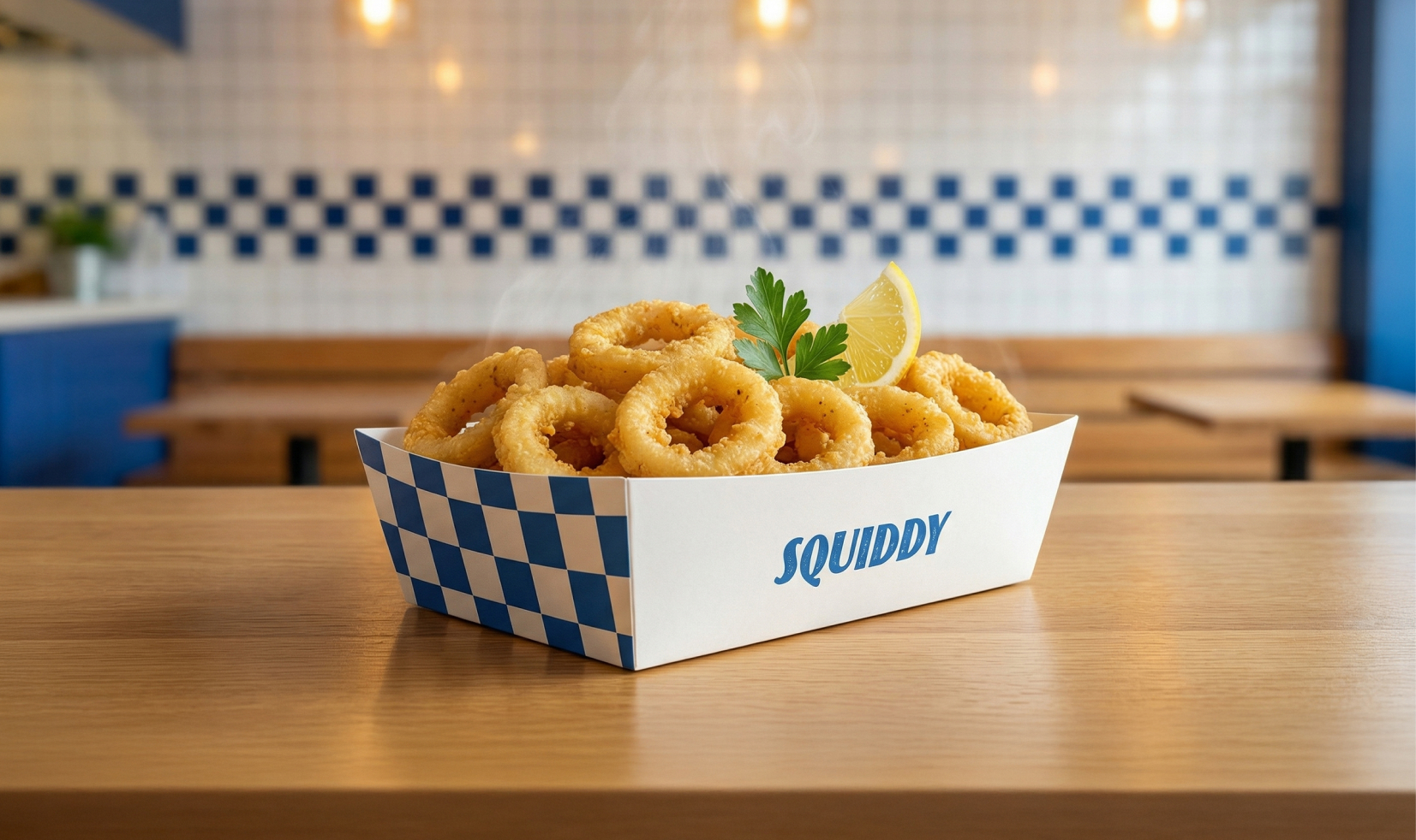
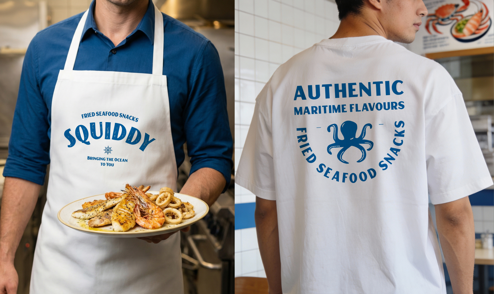
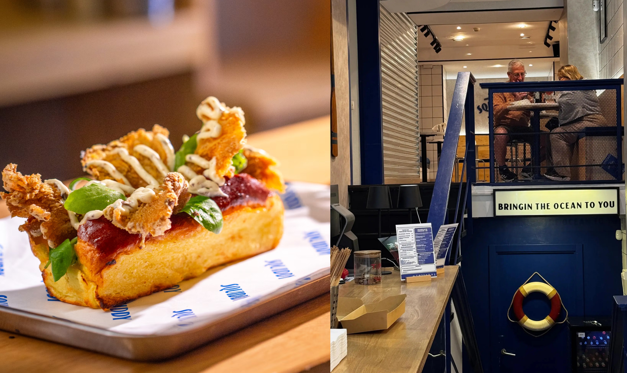
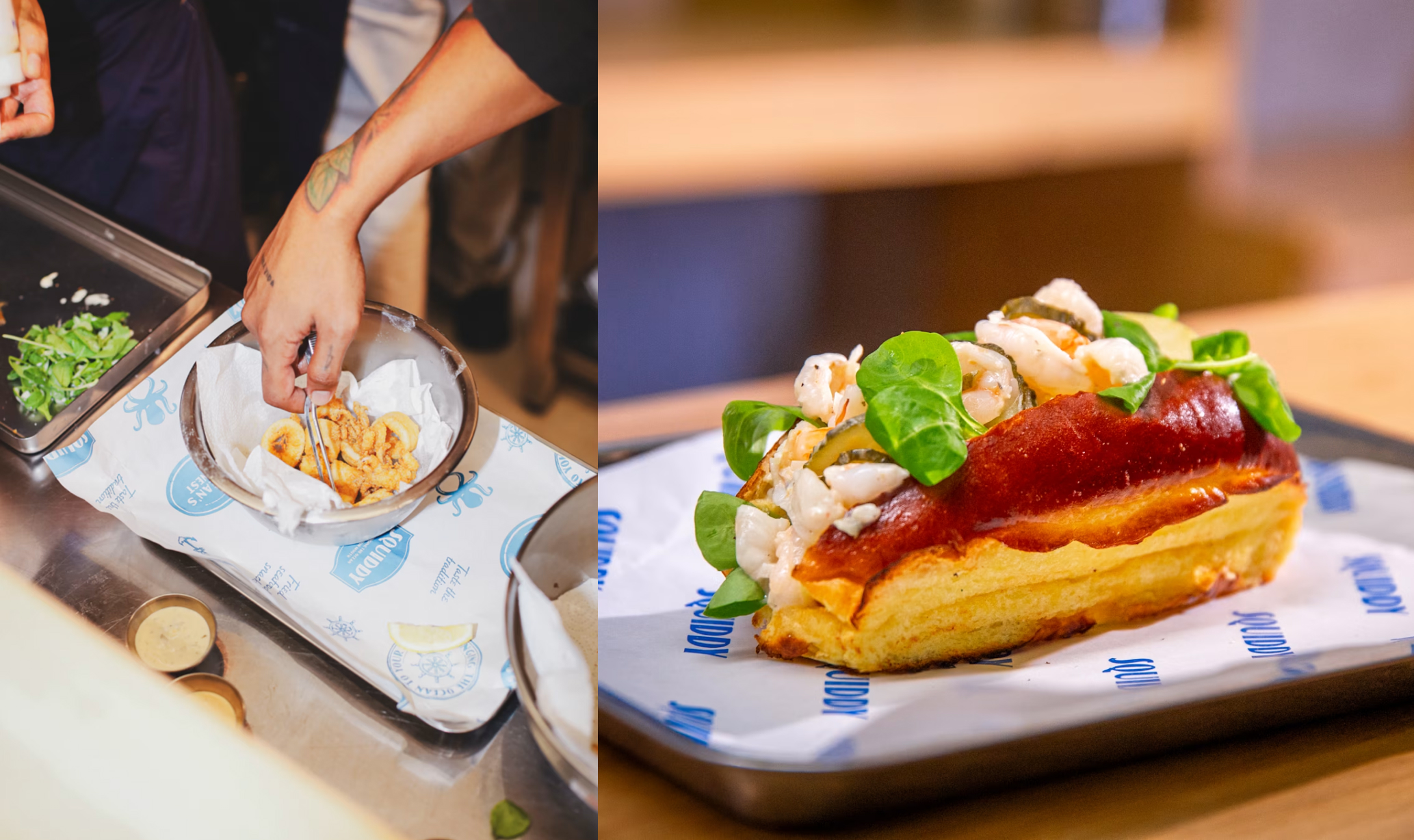
Brand in Action
The brand was designed to perform in real-world conditions, not just exist as static visuals. Every element was tested and applied across live environments, from packaging and menus to on-ground customer interactions.
This ensured the identity holds up in fast-paced QSR operations, where clarity, speed, and usability directly impact experience. The result is a brand system that feels alive in action, consistently used, recognised, and reinforced through everyday touchpoints.