Smash set out to enter a crowded protein bar market dominated by exaggerated health claims and overdesigned packaging.
The challenge was to create a brand that communicated clean nutrition, performance credibility, and taste confidence without sounding preachy or looking generic. The identity needed to appeal to disciplined, active consumers while remaining clear, honest, and easy to trust
Solution
Performance-First Brand System: Built a bold and loud identity that puts nutritional clarity and product honesty at the forefront. The visual language and tone were designed to feel direct, confident, and no-nonsense.
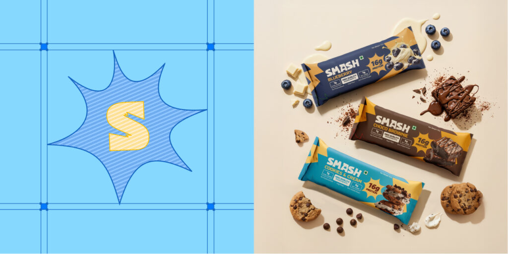
Packaging & Flavor Architecture: Designed a structured packaging system across flavours that balances strong shelf impact with clear nutritional communication, making SMASH instantly recognizable and easy to choose.
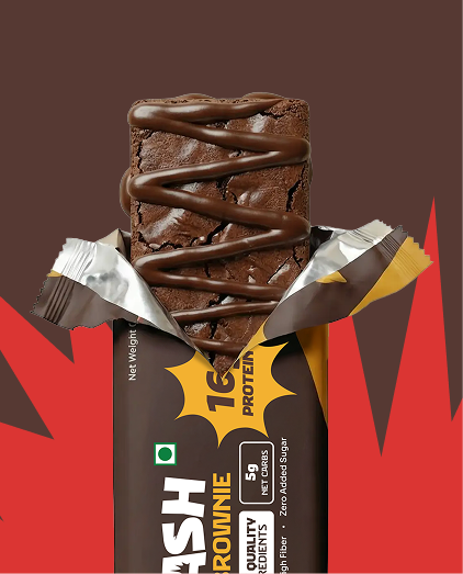
Three Flavours, One Vision
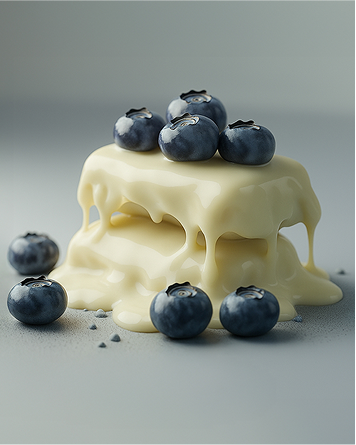
Blueberry
Choco Brownie
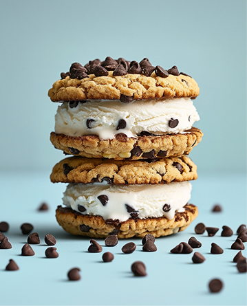
Cookies and Cream
The Moodboard
Creative Direction
The moodboard explores a playful and high-energy brand world inspired by modern snack culture. Bold colors, expressive typography, and dynamic compositions create a brand that feels fun, loud, and instantly recognizable.
Logo Direction
Bold and expressive wordmarks with playful distortions and graphic shapes. The direction favors strong lettering that feels energetic, memorable, and packed with personality.
Color Palette
A vibrant palette led by electric blues and punchy yellows. The high contrast keeps the brand visually loud and ensures strong shelf visibility.
Typography Direction
Playful, chunky typography that feels bold and dynamic. Letterforms stretch and shift to add movement, energy, and a distinct brand voice.
Packaging Direction
Packaging focuses on bold color blocking, large typography, and clear product communication.
The goal is strong shelf presence and instant flavor recognition.
Defining Color and Typography
A thoughtful color palette and typography system were developed to reflect Matram’s rooted yet refined identity.
Warm, earthy tones were paired with elegant type to create a balance between heritage and modern sophistication, ensuring the brand felt premium while remaining culturally grounded.
Staff Uniform Design
The staff uniforms were also thoughtfully designed to align with the brand’s visual language.
The goal was to ensure that every member of the team visually represented the restaurant’s refined yet rooted personality, maintaining consistency across every customer interaction.
Thoughtful Menu Experience-led Crafting
Stamps became a critical element of Matram’s communication system, appearing across takeaway packaging and printed materials to create a strong visual signature.
The menu was designed as a hardbound experience, with each menu treated differently to enhance the tactile and visual storytelling of the dining journey.